Category / Student Work
Web Designer Profile- Luna
Andrew Hinton- Information Architect
- Hinton is currently working with an information architecture consulting practice but in the past, in addition to working with these types of businesses, he has also worked a lot with investment management companies among others.
- Hinton has been working in experience design and strategy for twenty years. He studied at the University of Louisville where he went to get an MA, as well as University of North Carolina at Greensboro where he got and MFA.
- As a person on the lecture circuit, Hinton uses public speaking skills every day. As a blogger and author, he also uses writing skills every day. He also actively uses his skills in design strategy, mobile design and content/ context strategy.
- Hinton is really interested in social software as a tool and an object of research. He uses and studies many different softwares including Facebook, Path and Twitter.
- Some people he works with and admires are people who are also part of the Information Architecture Foundation which he helped create, including Abby Covert, Judy Siegel and Samuel Bowles.
- Three websites-
Most of Hinton’s work is in the strategic background aspect as opposed to the visual components. These are three projects he has worked with.
- http://iainstitute.org/en/about/our_mission.php– This is an institute which was started in part by Andrew Hinton. Committed to education, advocacy and services, this institute strives to bring awareness to the importance of the “invisible work” of information architecture that is usually looked over. One of the values listed is that of “strengthening brand” which I think is something that can make or break a brand, but is often not highly valued.
- https://investor.vanguard.com/corporate-portal/– This is one of the earlier websites which Hinton helped create as the senior information architect. I admire it because I think his detail and emphasis on brand shows and what is located on the front page is well curated. In addition, I think it is important to make something complicated like investing easy to understand and I think he did a good job doing that with this website.
- http://www.macquarium.com/services/– I really liked this websites because I thought it was really interesting at first glance and did not realize it wasn’t a “creative’ type website. I think the brand is simple and elegant and the way in which he laid out the flow of the website to be easy for an every-day user is important. Overall it seems that he tries to make more complicated corporations and businesses more accessible for everyday users and I admire that!
Burt_Holly_webdesignerprofile
Web Designer Profile
Katie Kavolcin
What type of companies have they worked for? Currently working at Sparkbox
Or, what types of companies do they have as clients?
Old Spice wanted to create a Museum of Manliness to show off the brand’s personality via the iconic Buoy Bottle design. I was able to have fun with the brand to create a space for an event to showcase everything Old Spice, including a “mandelier,” hand-shaved typography, and a giant buoy bottle wall.
Where did they learn how to do their job? How many years of experience do they have?
She has a degree in graphic design from Columbus College of Art & Design where she obsessed over typography and layouts.
What are the skills they use every day?
When her face isn’t pressed against her computer screen she can be found obsessing over her dog, riding her bike, and traveling.
What software or programming languages do they know?
She loves to be involved in the entire process, from research to wireframes to concepts through full execution.
Who are their mentors or influencers—people they admire?
She did not say anybody, however all of her work revolves around women’s rights especially equaling the playing field for women in web design.
Finally, find 3 projects in their portfolio that you enjoy and describe why you enjoy each one in 3–4 sentences. Save links to a few images of each project or (if the projects are existing websites) links to live websites.
Old Spice
http://kovalc.in/projects/old_spice.html
This was a pop up museum created by Old Spice to present how manly they are. I think this is a strong contrast to most of her work which focuses primarily with women issues. However it is very aesthetically pleasing and has a sense of humor.
Bernie Sander’s T-Shirts
A lot of her work involves political and social activism and alines well with my point of views. I love these shirts anything used to push Bernie’s campaign I am always for. I find them extremely aesthetically appealing and relevant to the age group/ visual audience that would be perspective voters.
https://dribbble.com/shots/2143978-BERNIE-2016
Girl Develop It
https://www.girldevelopit.com/materials/intro-web
She teaches at the program Girl Develop It. This foundation was created in order to give free classes to women who want to have careers in web design. There is great information on the website which is also easily understood.
Compile all of the information you just researched and post it to our class website under the Category “Web Designer Profile”
Web Designer Profile (Sherry)
Donna Jean Pallotta

Donna Pallotta is currently the Creative Director, Manager and Senior Graphic Designer at Rockwell Group. She was also the multimedia designer at Diller Scofidio + Renfro. She has designed and programmed the LED stairs for the Lincoln Center Promenade, and was the lead designer for Tommy Hilfiger’s e-commerce site.
She went to SVA for Graphic Design which she graduated in 1987 and Columbia for her Architecture MArch to learn. She uses her graphic design skills every day, including use of the Adobe Design suite. She also designs websites which requires knowledge of web design. Design tools she uses include: Adobe Illustrator, Photoshop, InDesign, After Effects, OmniGraffle, UX Toolbox, HTML, CSS, AutoCad, Sketchup, 3D Studio Max, Final Cut Pro.
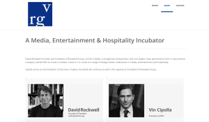
Rockwell Group Ventures is a project that I helped Donna design. It is the website for the launch of Rockwell and Cipolla’s venture company. I like the website for the minimalistic design and clean look.
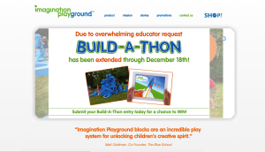
Imagination Playground’s website is a project that Donna helped start and design, and I now manage all the content. There are flaws within this website because it is hosted through Ruby and Rubenstein has control over the main coding aspects of the site, but I recently redesigned the navigation menu and many of the pages so that it is easier to navigate through.

The Lincoln Center LED Stairs is an older project Donna worked on. I like it because it is well designed and has a “cool” or futuristic aspect to it. I think it adds a lot of interest to simple steps.
Web Designer Profile- Paul Armstrong
PAUL ARMSTRONG

A. Currently, the graphic designer is the Co-Founder and Chief Creative Officer of the company ChoreMonster. In addition to that, Paul Armstrong was the founder, designer, developer, and photographer of the creative company Wiseacre Digital, LLC. He has also spent time volunteering as a graphic designer and photographer for the Four Corners Community Church.
In the past, Armstrong has designed logos for CMWealth Management, Sideshow Coffee, Flock, Subway and Facebook. Currently, as the Co-Founder of ChoreMonster, Armstrong works with a demographic of mostly parents and creates work appealing to their children.
B. The designer developed his skill at Taylor University from 1991 to 1993. He then completed his bachelors degree in graphic design at Messiah College and graduated in 1995. Armstrong has been working in the field for over 18 years in total.
C. Everyday Paul Armstrong uses his skills in illustration and photography to design projects on the computer for his website ChoreMonster. He constantly works on the content and design of the website and all other creative aspects that are associated with it. Armstrong also works everyday to promote and develop the branding of the website.
D. The graphic designer knows html web design. He also works with user interface design and user experience design. He is also proficient in the Adobe Suite.
E. Someone that Armstrong would ad mire would be his business partner and the Co-Founder of ChoreMonster, Chris Bergman. Bergman had worked with Armstrong at Wiseacre Digital for two years before they created ChoreMonster. Before that he was the marketing and product manager of Buzz360, the marketing manager of Photrade, the founder of Pause Magazine, and the art director of Daily Bread Skate Magazine.
Project 1:
I love Armstrong’s fun personality and I feel that carries over to his designs. I like this in particular because he managed to create a brand identity that appeals to an audience that is older and younger. When parents find the website they are interested enough in its design and the content to show to their children. I also enjoy the colors the artist used. I feel like they add to the experience to make it more enjoyable.
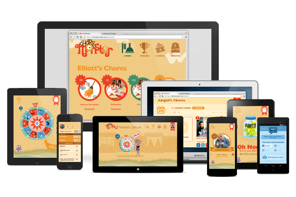

Link: https://www.choremonster.com
Project 2:
Armstrong also did the branding of his previous company, Wiseacre Digital. I love the design of this logo he had created because it is extremely sleek and modern. The website is also extremely impressive in that it is easy to navigate and simple.

Link: http://wiseacredesign.com
Project 3:
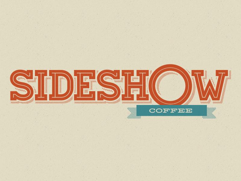
This is a logo Armstrong had designed for Sideshow Coffee. I really enjoy the type of font he had used as well as the color. It has a nice style to it and I feel it suits the company well. I also like the types of warm colors he used.
No link
Allison Pinz
Web Designer Profile- Yesenia Perez-Cruz

Yesenia Perez-Cruz
User Experience Designer (UX)
a) Yesenia Perez-Cruz is currently a Senior Product Designer at Vox Media. Previously she was a Senior Designer at Happy Cog and a User Experience designer at Intuitive Company. Through her young career she has designed for clients like Zappos, MTV, and Chef Jose Garces.
b) Yesenia Perez-Cruz spent four years at Drexel where she studied graphic design.
c) As a designer Yesenia is involved in strategy, information architecture, wireframes, and aesthetic design, as well as communicating with developers about how to make that come to life.
d) In an interview with Tina Essmaker, Yesenia said her time at Happy Cog has influenced her greatly and was a place for great experimentation along great mentors. “I was encouraged to push myself and find new ways to solve problems, which is how I grew so quickly.” It was her first job after college.
MTV O MUSIC AWARDS 3
Yesenia Perez-Cruz has been designing “the look” for The O Music Awards for the past three years. The O Music Awards are an annual online music festival and awards show. The design work done by Yesenia in this project is really good because she creates well organized graphics and her compositions are very strong. Much of her work in this project serves as purpose, as they are created to interact with the user/audience and deliver information.
EL NUEVO DÍA
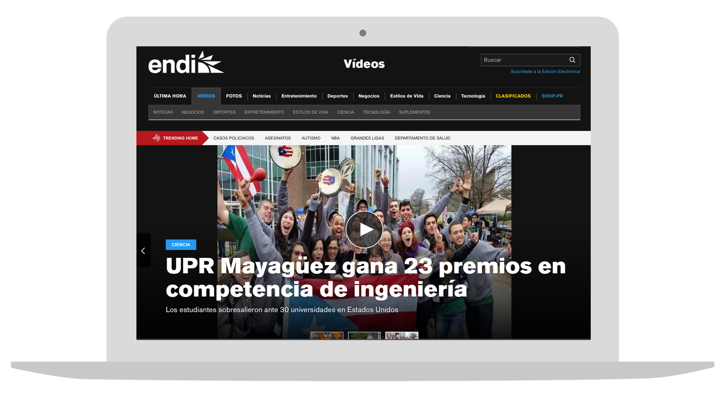
El Nuevo Día is the most trusted and read newspaper in Puerto Rico. Yesenia redesigned and brought to life their website and mobile site. I really like her work in this project because she takes into consideration the importance of the newspaper and their establishment in the community so her design is more straight forward, elegant and accessible.
GARCES Project
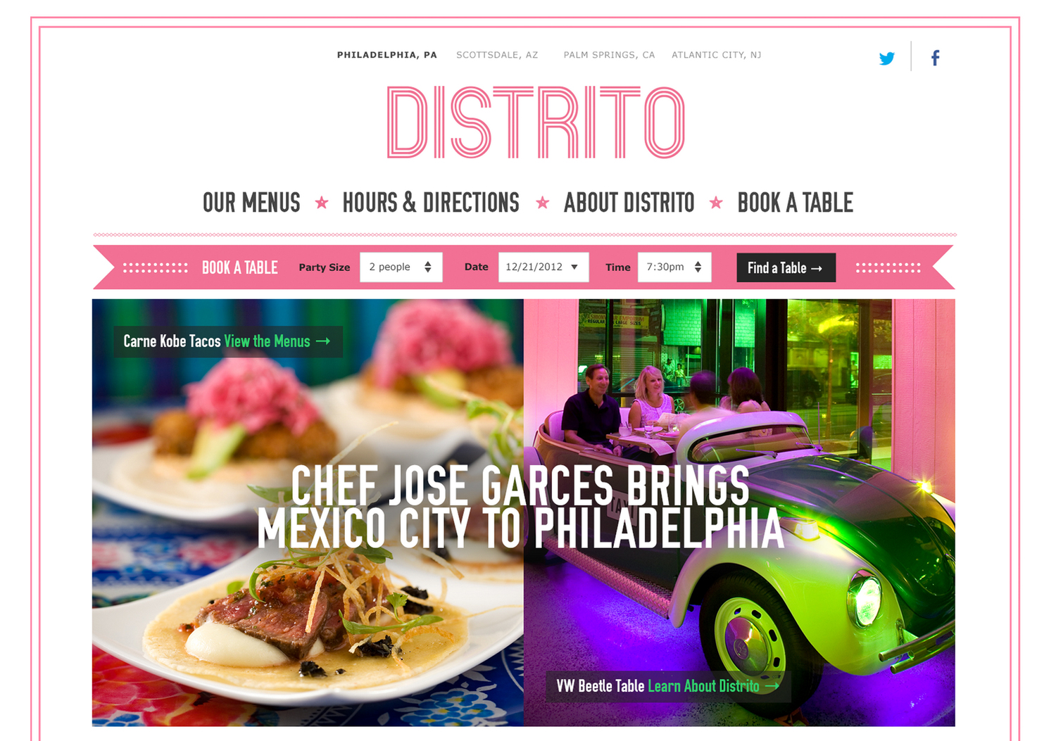
Yesenia also designed the website and design system for Iron Chef Jose Garces. Her work for this website is great because it brings focus to the two most important things about the restaurant , the food and the venue. Her website is also very easy to use and well organized by importance to both the costumer and the owner. Her color palette also goes well together by having pictures and layout colors that go well together.
Web Designer Profile | Dimitri Didorenko
2 a) Dimitri Didorenko has developed web applications as a Senior Front-End Developer since 2009, and for the past 5 months has worked at Outbox.
2 b) Didorenko first attended Optical-Mechanical Technical College in Ukraine in 1988 and has received additional degrees in sound engineering and biblical studies.
2 c) Didorenko’s two greatest skills are Web Development and Date Management, but he states that the opportunity to work in many different environments has led him to develop a greater array of web projects for different companies.
2 d) Didorenko’s primary languages are JavaScript / AJAX, PHP, and HTML5.
3 a) http://www.outboxtechnology.com/
Outbox facilitates ticket sales for large venues and stadiums. What interests me the most about the site is how easily it is navigated. Although I have little interest in the actual service Outbox offers, I appreciate the design of its web page.
3 b) https://www.desjardins.com/ca/index.jsp
Desjardins is a cooperative financial group in Canada and similar to my interest in Outbox’s site, I’m more attentive to UI than what is being advertised. It’s hard to find something that I like about Desjardins’ site. The “about us” tab has an interesting collapsing animation.
3 c) http://www.2020spaces.com/
I’m not clear what service 2020spaces is offering, but I think how the web page uses transitional animations is effective. It’s unusual that such an involved UX doesn’t quickly become frustrating for the viewer. I think it’s because the animations are quick and precise, guiding the user through the web page rather than distracting them.
Pamela Pavliscak
Pamela Pavliscak
Part ethnographer, part data scientist, and part behavioral psychologist
What type of companies have they worked for? Or, what types of companies do they have as clients?
Adecco, Ally, Audible, Citi, Corcoran, Digitas, eMusic, IEEE, KLM, NBC Universal, The New York Public Library, PNC, Prudential, Publicis, Quest Diagnostics, Sanofi-Aventis, Sealy, Sprout, SunTrust, VEVO, Wiley
Where did they learn how to do their job? How many years of experience do they have?
Pamela has a MS in information science from University of Michigan and 15 years of experience.
What are the skills they use every day?
Through her startup Change Sciences they help companies create a better understanding of who their consumer is through user experience labs, mobile testing, remote usability testing, in-context interviews, focus groups, competitive benchmarking, ethnographic studies, diary studies, online surveys, card sorts, social media sentiment analysis and cross-channel research.
What software or programming languages do they know?
Who are their mentors or influencers—people they admire?
Finally, find 3 projects in their portfolio that you enjoy and describe why you enjoy each one in 3–4 sentences. Save links to a few images of each project or (if the projects are existing websites) links to live websites.
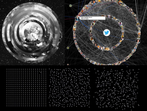
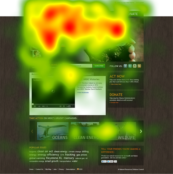
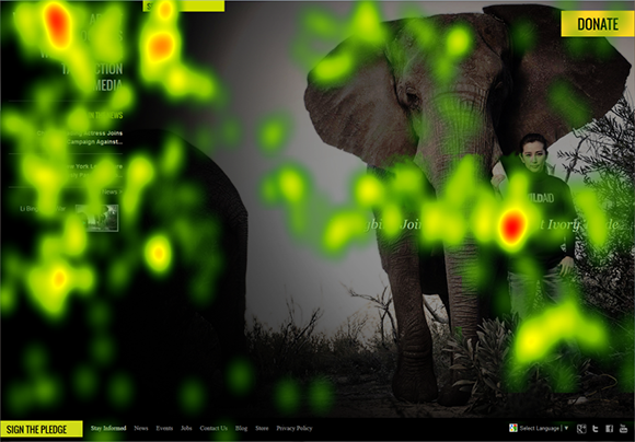
1)Collected data on what the user initially sees on a charity page. For a charity their main mission is for the viewer to see the mission statement and the ways to donate. Change Sciences uses eye heat maps to identify the main focus point.
2) She collects data on happiness and how technology makes someone feel smarter, more connected, and happier. The data then lead to 5 conclusions about how happiness connected with the success of websites. Ultimately positive emotions result in positive actions.
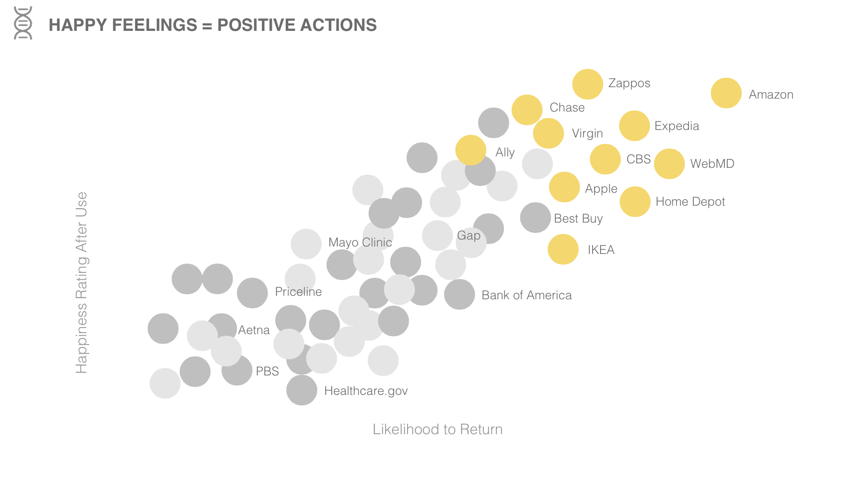
https://www.changesciences.com/the-impact-of-happiness-on-online-experience
3) Pamela researches and looks through data to see the new relationship between phones, people, and interaction between each other. She gathers data on where we use our phone more often and when with the focus not only in the US but globally too. With all this information, she concludes with how it can create conclusions in order to create a better user experience.
Web Designer Profile – Maria Jessica
JOE STEWART (interaction design)
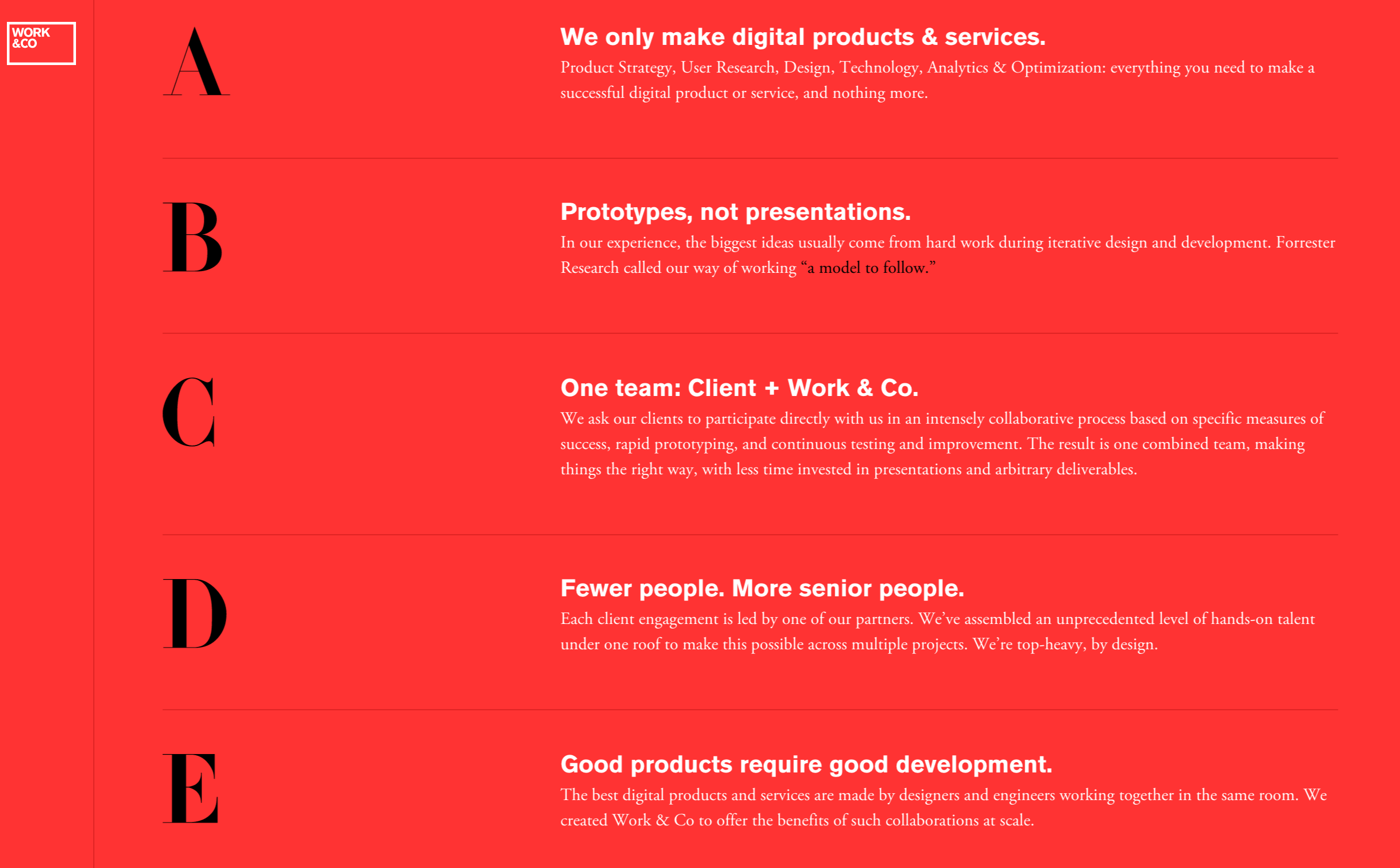
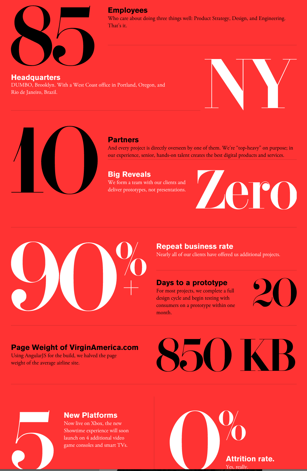
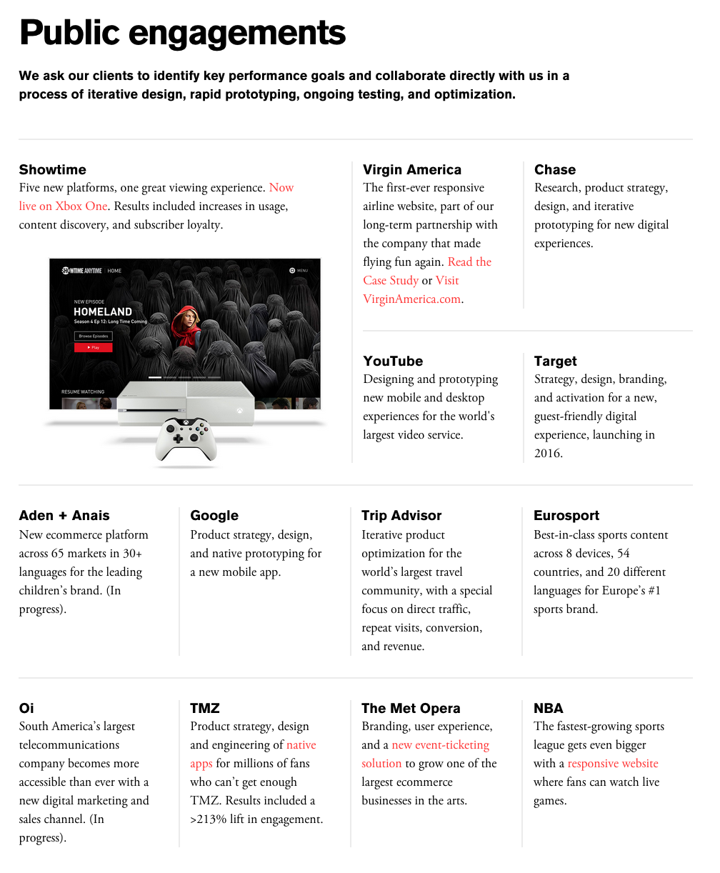
He works as a partner at Work&Co, a digital product design company based in New York and Portland.
- He worked design and branding such as Virgin America, Target, Chase, Aden + Anais, Goodgle, Trip Advisor, Eurosport, Oi, TMZ, The Met Opera, NBA and Youtube. He also was a partner with Global Creative Director at Huge. He works with a companies to participate directly with his team in collaborative process such as measures of success, rapid prototyping, and continuous testing, improvement. For example Target, they create a strategy, design, branding, guest friendly digital experience launching in 2016
- He has 18 years of digital experience and hands on designer. He was named as one of the “top 50 Web Designer” in the world by Net Magazine. He is also a public speaker within a design community, writer, and juror for Cannes, SXSW, the webby awards, the pixel awards, and Fast Co. He likes to think that everyone is responsible for the product as a whole. IF something is wrong, there is nobody to blame
“I love user testing prototypes, and when you know real people going to be touching your designs at the end of the week it changes the way you think about that you’re making in a very real way” – Joe Stewart
He learned that prototyping or the process of creating an interactive working model of a design proves a design team the ability to look how the design will work structurally and interactively.
- “The earlier you start prototyping, the earlier you get to see how fucked up your design are and start fixing them” – Joe stewart
Because in relationship between the designer and developers can improve when they see the result to see the flaws and develop it. For example first we just simply expresses our idea, second tyring to understand the overall design, third is making the user test.
- Joe stewart usually use software for work such as quartz composer, UX, Marvel, Proto, invision, after affect, ad keynote.
- His two biggest inspiration are the design of BRAUN and PETER SAVILLE. He is completely obsessed by the pencils of Faber-Castell and Swiss Army Knives
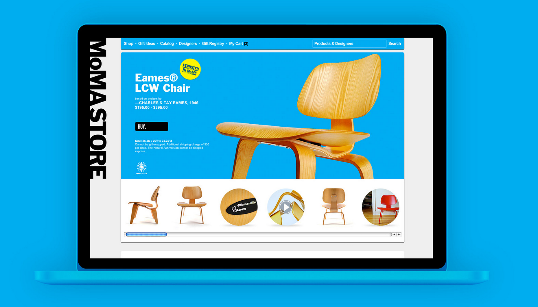
In my opinion this Moma Store’ web design is easy for the viewer to see the detail the the product. It doesn’t have much color but it emphasize the product and the Moma Store has it owns black color font so it would not confuse the viewer. It is simple and contains what the viewer needs when they want to buy the product without going to the stores.
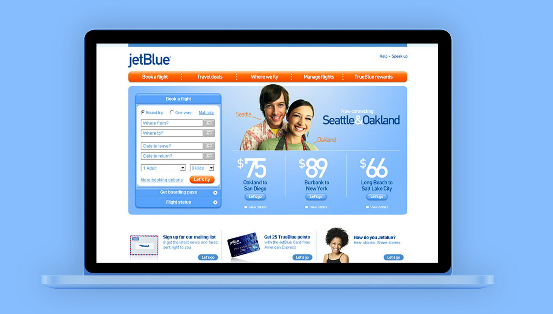
The first page of the jetblue design shows what people need when they go to the airline’s website, how to purchase the tickets and ticket promo. Some website might show the introduction, clip and the airline identity. But what actually people need is straight to the point how to purchase the ticket and the ticket promo is part of the business oriented.
What I like about this company design is simple and emphasize the information. Such as the background of the company information by playing with the size and color of the font. And their vision and mission is short but can bee seen by the clients they have been working with.