If it doesn’t exist on the Internet

thanks_wikipedia_0-500x500

Kenneth Goldsmith describes the world of academic resources to be in the midst of a stubborn transition from physical to virtual, digital. At the very end of his argument, he warns:

“Shhhh… the new radicalism is paper. Right. Publish it on a printed page and no one will ever know about it. It’s the perfect vehicle for terrorists, plagiarists, and for subversive thoughts in general. In closing, if you don’t want it to exist — and there are many reasons to want to keep things private — keep it off the web.”

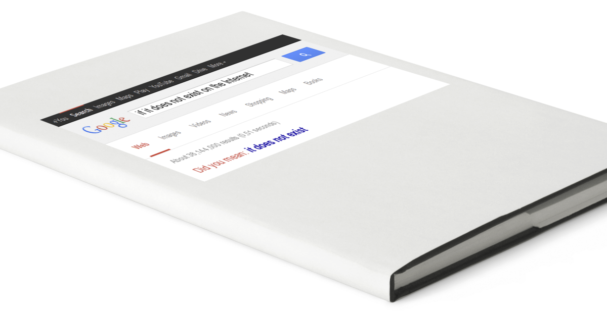
My visual response is in two parts. The first and more significant one depicts the cover of a book. Usually when we look to a source of information for something in particular, we must search for it. Here I chose this search to take place within a virtual space, because web-based search engines like Google have become our first if not only attempts to look for more specific information.

The internet has become the most familiar and accessible way of researching. This mass-appeal bleeds over into the world of academia, which revolves around the abundance of well-researched documents and articles.

3_blank_books_magazines_vector

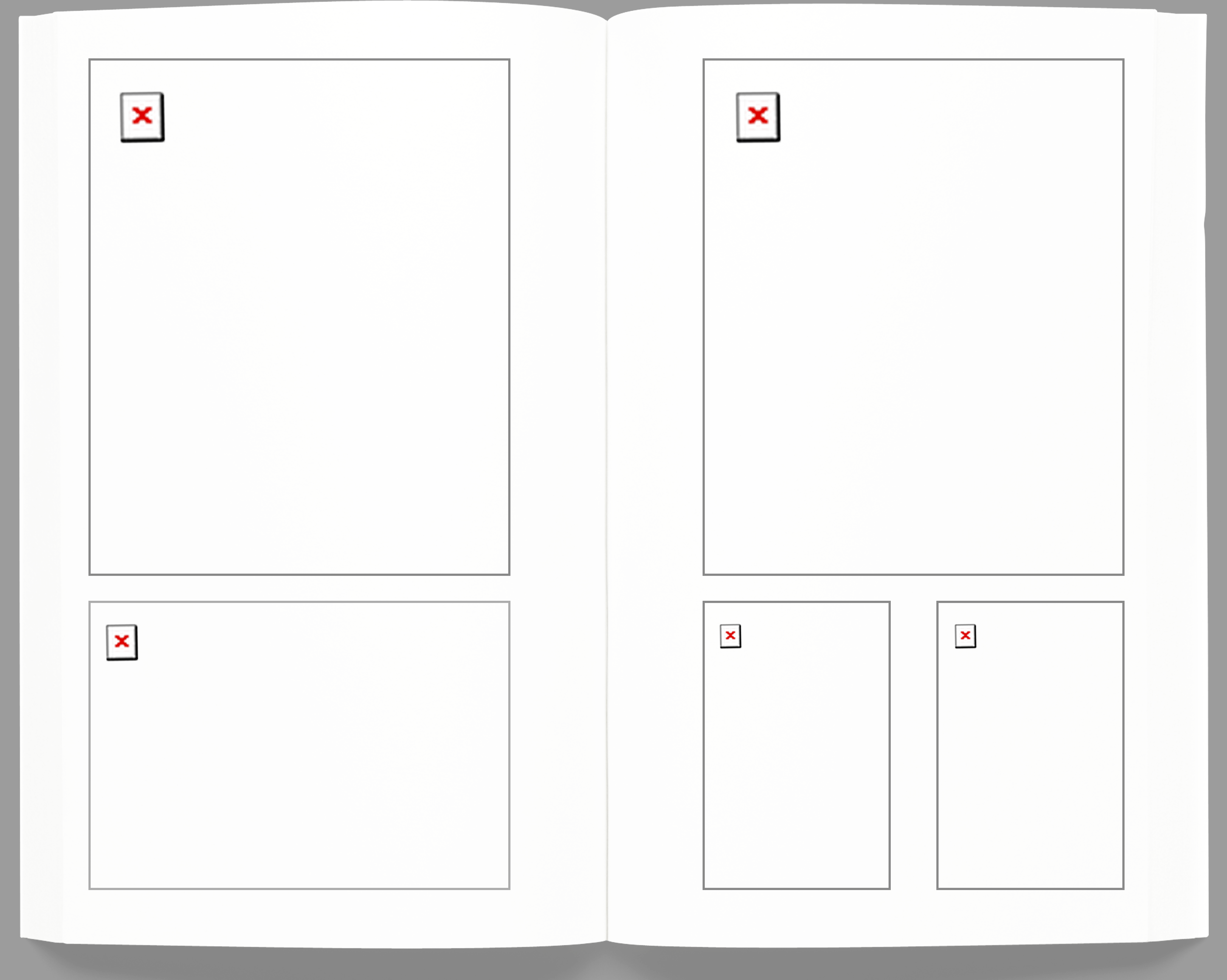
The second part of my response develops this point even further, showing the inside of the book as being completely useless. These familiar red X’s are often displayed in web applets/applications that attempt to display information, but have essentially failed.

GitHub Procedure

GitHub is an online, open source collaboration platform. It essentially stores files and folders in a cloud-based server system, sort of like Dropbox. Unlike Dropbox, you must manually sync any changes you make to the file and folders that are shared among your collaborators.

Here is what you should do when you want to make a change to the your personal GitHub files for this class:

  1. Make sure your branch is set to gh-pages
  2. Press Sync
  3. Make changes to your files
  4. Check to make sure the changes in red and green are what you did.
  5. Fill out the Commit title and description
  6. Press Commit
  7. Press Sync

Web Designer Profile- Luna

Andrew Hinton- Information Architect

    1. Hinton is currently working with an information architecture consulting practice but in the past, in addition to working with these types of businesses, he has also worked a lot with investment management companies among others.
    2. Hinton has been working in experience design and strategy for twenty years. He studied at the University of Louisville where he went to get an MA, as well as University of North Carolina at Greensboro where he got and MFA.
    3. As a person on the lecture circuit, Hinton uses public speaking skills every day.  As a blogger and author, he also uses writing skills every day.  He also actively uses his skills in design strategy, mobile design and content/ context strategy.
    4. Hinton is really interested in social software as a tool and an object of research.  He uses and studies many different softwares including Facebook, Path and Twitter.
    5. Some people he works with and admires are people who are also part of the Information Architecture Foundation which he helped create, including Abby Covert, Judy Siegel and Samuel Bowles.
    6. Three websites-

Most of Hinton’s work is in the strategic background aspect as opposed to the visual components.  These are three projects he has worked with.

      1. http://iainstitute.org/en/about/our_mission.php– This is an institute which was started in part by Andrew Hinton. Committed to education, advocacy and services, this institute strives to bring awareness to the importance of the “invisible work” of information architecture that is usually looked over.  One of the values listed is that of “strengthening brand” which I think is something that can make or break a brand, but is often not highly valued.  
      2. https://investor.vanguard.com/corporate-portal/– This is one of the earlier websites which Hinton helped create as the senior information architect. I admire it because I think his detail and emphasis on brand shows and what is located on the front page is well curated. In addition, I think it is important to make something complicated like investing easy to understand and I think he did a good job doing that with this website.
      3. http://www.macquarium.com/services/– I really liked this websites because I thought it was really interesting at first glance and did not realize it wasn’t a “creative’ type website. I think the brand is simple and elegant and the way in which he laid out the flow of the website to be easy for an every-day user is important.  Overall it seems that he tries to make more complicated corporations and businesses more accessible for everyday users and I admire that!


Web Designer Profile

Katie Kavolcin

What type of companies have they worked for? Currently working at Sparkbox

Or, what types of companies do they have as clients?

Old Spice wanted to create a Museum of Manliness to show off the brand’s personality via the iconic Buoy Bottle design. I was able to have fun with the brand to create a space for an event to showcase everything Old Spice, including a “mandelier,” hand-shaved typography, and a giant buoy bottle wall.

Where did they learn how to do their job? How many years of experience do they have?

She has a degree in graphic design from Columbus College of Art & Design where she obsessed over typography and layouts.

What are the skills they use every day?

When her face isn’t pressed against her computer screen she can be found obsessing over her dog, riding her bike, and traveling.

What software or programming languages do they know?

She loves to be involved in the entire process, from research to wireframes to concepts through full execution.

Who are their mentors or influencers—people they admire?

She did not say anybody, however all of her work revolves around women’s rights especially equaling the playing field for women in web design.

Finally, find 3 projects in their portfolio that you enjoy and describe why you enjoy each one in 3–4 sentences. Save links to a few images of each project or (if the projects are existing websites) links to live websites.

Old Spice

http://kovalc.in/projects/old_spice.html

This was a pop up museum created by Old Spice to present how manly they are. I think this is a strong contrast to most of her work which focuses primarily with women issues. However it is very aesthetically pleasing and has a sense of humor.

Bernie Sander’s T-Shirts

A lot of her work involves political and social activism and alines well with my point of views. I love these shirts anything used to push Bernie’s campaign I am always for. I find them extremely aesthetically appealing and relevant to the age group/ visual audience that would be perspective voters.

https://dribbble.com/shots/2143978-BERNIE-2016

Girl Develop It

https://www.girldevelopit.com/materials/intro-web

She teaches at the program Girl Develop It. This foundation was created in order to give free classes to women who want to have careers in web design. There is great information on the website which is also easily understood.

Compile all of the information you just researched and post it to our class website under the Category “Web Designer Profile”

Web Designer Profile

1. Edmund Yu – UI/UX Designer

2. a. Edmund has worked for Bloomz, Global Scholar, UX CardSort, Just for Fun, Microsoft, and Vizrea.

b. Edmund attended The Art Institute of Seattle, and his first position in UX was at Vizrea/ WebFives. Edmund has ten years of experience.

c. Edmund uses skills like prototyping, content management, design leadership, team management, user management, account management, data visualization, and user centered design.

d. Edmund uses Adobe Photoshop, Illustrator, After Effects, Flash, Balsamiq, HTML/ CSS5, Java, JQuery, Just in Mind, Blender 3D, and Angular JS.

e. Not mentioned.

3. Edmund works with Bloomz as head of product design and manages the wire framing, prototyping, visuals, and interaction for the website. The site is very user-centered and has a clean layout and graphics. The platform is also very straightforward and color palette is consistent throughout all digital platforms. The platform is used for teachers and parents to communicate, and it communicates very well to both parties on how to use the platform without any difficulties.Screen Shot 2015-09-09 at 7.18.59 PM

Web Designer Profile (Sherry)

Donna Jean Pallotta

Donna Pallotta is currently the Creative Director, Manager and Senior Graphic Designer at Rockwell Group. She was also the multimedia designer at  Diller Scofidio + Renfro. She has designed and programmed the LED stairs for the Lincoln Center Promenade, and was the lead designer for Tommy Hilfiger’s e-commerce site.
She went to SVA for Graphic Design which she graduated in 1987 and Columbia for her Architecture MArch to learn. She uses her graphic design skills every day, including use of the Adobe Design suite. She also designs websites which requires knowledge of web design. Design tools she uses include: Adobe Illustrator, Photoshop, InDesign, After Effects, OmniGraffle, UX Toolbox, HTML, CSS, AutoCad, Sketchup, 3D Studio Max, Final Cut Pro.

Screen Shot 2015-09-09 at 6.24.40 PM

Rockwell Group Ventures is a project that I helped Donna design. It is the website for the launch of Rockwell and Cipolla’s venture company. I like the website for the minimalistic design and clean look.

Screen Shot 2015-09-09 at 6.25.01 PM

Imagination Playground’s website is a project that Donna helped start and design, and I now manage all the content. There are flaws within this website because it is hosted through Ruby and Rubenstein has control over the main coding aspects of the site, but I recently redesigned the navigation menu and many of the pages so that it is easier to navigate through.

The Lincoln Center LED Stairs is an older project Donna worked on. I like it because it is well designed and has a “cool” or futuristic aspect to it. I think it adds a lot of interest to simple steps.

Web Designer Profile- Paul Armstrong

PAUL ARMSTRONG

0a94761

A. Currently, the graphic designer is the Co-Founder and Chief Creative Officer of the company ChoreMonster. In addition to that, Paul Armstrong was the founder, designer, developer, and photographer of the creative company Wiseacre Digital, LLC. He has also spent time volunteering as a graphic designer and photographer for the Four Corners Community Church.

In the past, Armstrong has designed logos for CMWealth Management, Sideshow Coffee, Flock, Subway and Facebook. Currently, as the Co-Founder of ChoreMonster, Armstrong works with a demographic of mostly parents and creates work appealing to their children.

B. The designer developed his skill at Taylor University from 1991 to 1993. He then completed his bachelors degree in graphic design at Messiah College and graduated in 1995. Armstrong has been working in the field for over 18 years in total.

C. Everyday Paul Armstrong uses his skills in illustration and photography to design projects on the computer for his website ChoreMonster. He constantly works on the content and design of the website and all other creative aspects that are associated with it. Armstrong also works everyday to promote and develop the branding of the website.

D. The graphic designer knows html web design. He also works with user interface design and user experience design. He is also proficient in the Adobe Suite.

E. Someone that Armstrong would ad mire would be his business partner and the Co-Founder of ChoreMonster, Chris Bergman. Bergman had worked with Armstrong at Wiseacre Digital for two years before they created ChoreMonster. Before that he was the marketing and product manager of Buzz360, the marketing manager of Photrade, the founder of Pause Magazine, and the art director of Daily Bread Skate Magazine.


Project 1:

I love Armstrong’s fun personality and I feel that carries over to his designs. I like this in particular because he managed to create a brand identity that appeals to an audience that is older and younger. When parents find the website they are interested enough in its design and the content to show to their children. I also enjoy the colors the artist used. I feel like they add to the experience to make it more enjoyable.

5c7e6cc2-8533-4564-a6da-7ad9720ce14b-large b5f069a7-2094-4317-b49e-7410cb94d701-large

Link: https://www.choremonster.com


Project 2:

Armstrong also did the branding of his previous company, Wiseacre Digital. I love the design of this logo he had created because it is extremely sleek and modern. The website is also extremely impressive in that it is easy to navigate and simple.

72231bb4-d873-4b0b-a9a1-f06580813cfc-large

Link: http://wiseacredesign.com


Project 3:

This is a logo Armstrong had designed for Sideshow Coffee. I really enjoy the type of font he had used as well as the color. It has a nice style to it and I feel it suits the company well. I also like the types of warm colors he used.

e006f10c-4353-4184-a49d-09db8a396ae1-large


No link


Allison Pinz