Front-End Developer | Rachel Smith


Currently, Rachel builds all of Active Theory’s websites, which is a creative digital production company in California. Their clients include Coca-Cola, Chevy, Google, Fox and Under Armor.

Rachel holds three Bachelor degrees – The first two are from The University of Queensland, Australia in Business Management and Information Technology.

She went on to receive her most recent and relevant degree in Creative/Interactive Media from the SAE Creative Media Institute, in Sydney.

According to her LinkedIn profile, her professional experience as a developer started in 2010.

Programming languages and software Rachel knows: SVG, HTML/5, PHP, WordPress, Flash, CSS, jQuery, ActionScript, MySQL, Javascript, CMS, AJAX, Apache.

She is highly self-driven, but often looks to fellow designers for inspiration in Podcasts and articles. She is a strong advocate for communities in which women are encouraged to learn and explore code and tech. She also mentions her “love affair with the web began when her dad first brought home a dial-up modem in ’97”.

She is an avid Twitter user (11k tweets), and posts articles on her blog every week. She also frequently shares demos and tips for interactive design on a site called codepen.io.

Floaty Flutter Rainbow Stars

Hairy rainbow text

These are two of the many demos that she has shared on her CodePen profile.

Going into this research, I assumed that the lines were quite blurry between the different kinds of web designers. My background is primarily in graphic design, and Rachel is definitely not a graphic designer. From a purely aesthetic sense, Rachel is not concerned with making consistently refined-looking work. When it comes to color and typography, she really couldn’t care less. What she enjoys exploring is the functions and features – the moving parts and the purposes they serve. Based on these two rainbow themed demos, she is clearly a master at making incredibly smooth interactive work. Their functions are to appear both fun and informal for the purpose of teaching others.

Active Theory

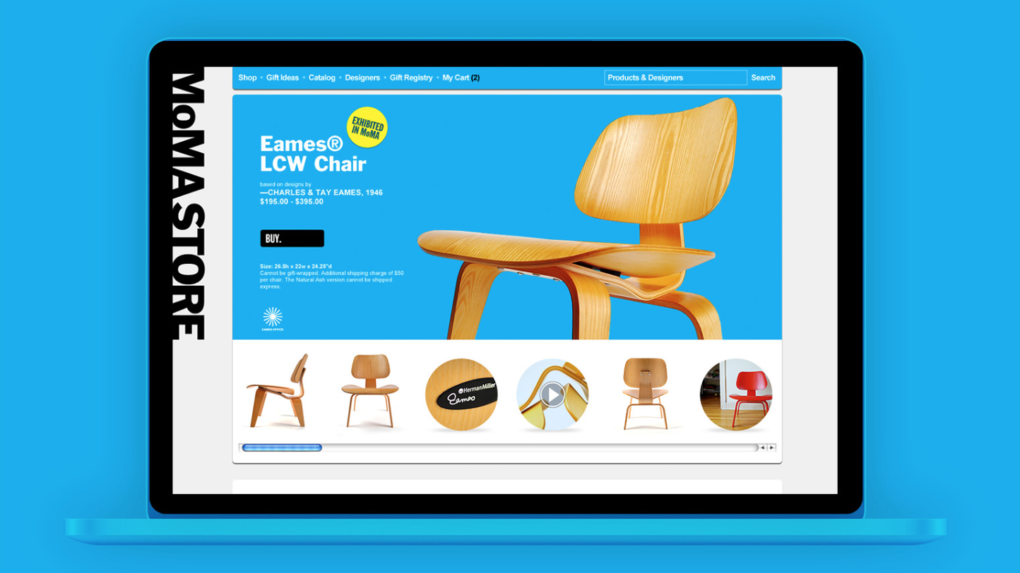
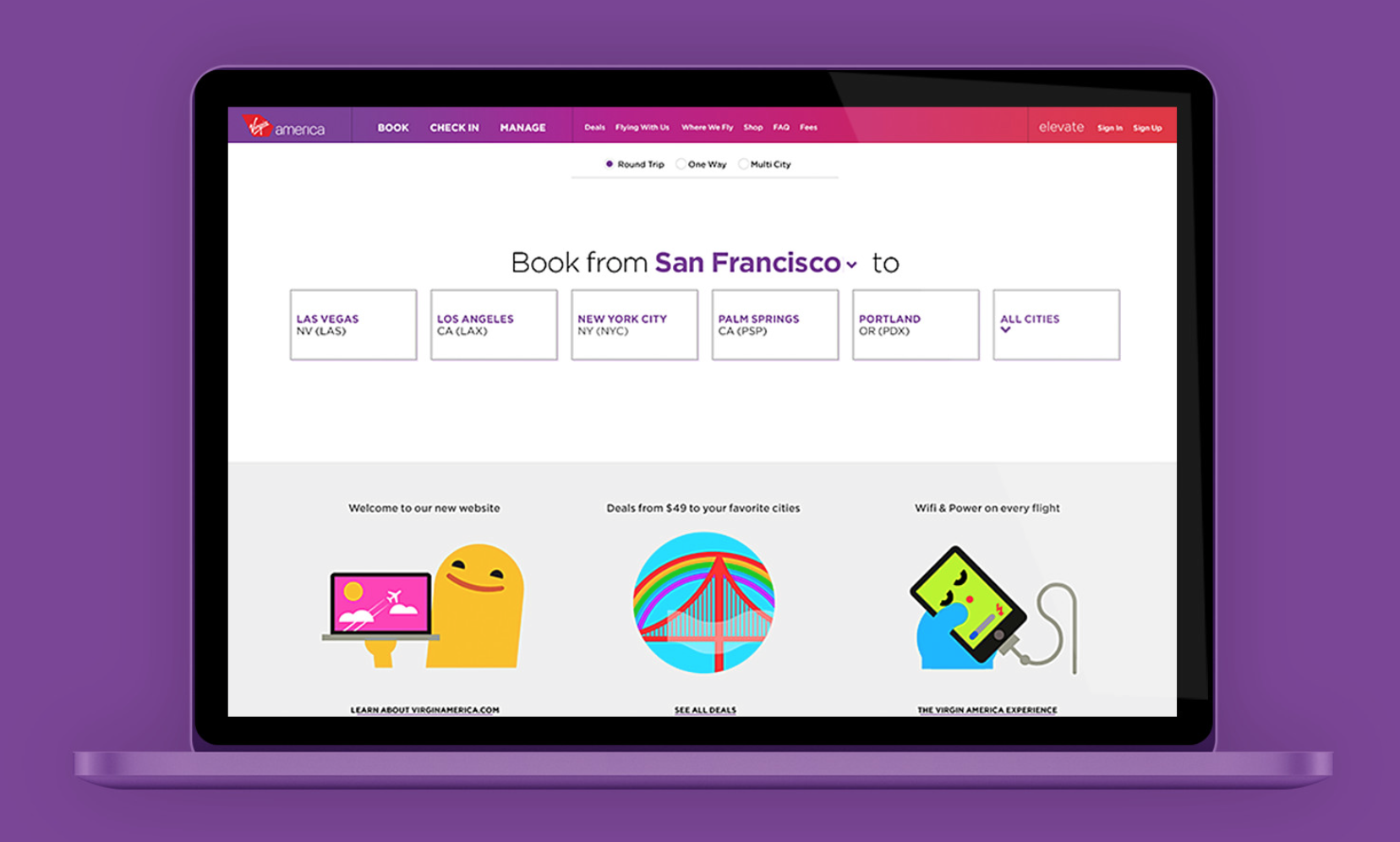
Her most recent commercial work is a stark contrast to her demos, and rightfully so. Here she is showcasing the skills that she demonstrates informally on CodePen. In this sense she is a highly practical designer. She applies code to situations by how she sees them, whether they are commercial or semi-academic. The user’s interaction with the website is polished, but not visually interesting. It feels up-to-date, and by corporate standards, that’s all that truly matters. I appreciate the subtlety of this work.

Web Designer Profile

Joe Stewart –interaction designer

    1. What type of companies have they worked for? Or, what types of companies do they have as clients?                                                                               He currently own a digital product design company, Work&Co. He used to work as an interaction designer. He worked at Huge for 7 years before he co-founded Work&Co. His client includes Target, MoMA store, Reuters , jetBlueVirgin America, Youtube,etc. Now his client include NBA, Google, Youtube, Virgin America,etc.
    2. Where did they learn how to do their job? How many years of experience do they have?                                                                                                                           As he described in the interview, as an interaction designer, you have to learn every 2 years. He worked at Huge for 7 years, then he co-founded Work&Co at 2013, which means he worked at Work&Co for 2 years now. He has 18 years of digital experiences.
    3. What are the skills they use every day?                                                                    He uses Quartz Composer and Form to see the design and the scale in prototype, he so user testing while he is not sure which prototype is better. Prototype is the skill he used everyday, instead of making presentation to his client.
    4. What software or programming languages do they know?                              He uses program like, Marvel,Proto.io,Invision. He also used AfterEffect or Keynote when he wants to look for something quick and cheap.
    5. Who are their mentors or influencers—people they admire?                          He is influence by the design works of BRAUN, design work of Peter Saville. He loves to take photo and post them on his VSCO page. He is also influence under the Todd Purgason at JUXT Interactive.

 3 projects

Screen Shot 2015-09-08 at 9.58.16 PM


MoMA Store

I think the design for the MoMA store is clever, I like how everything is very straight forward. It is good to look at. The object are the center of the page, unlike many other commercial good website. The image of the product has to zoom in to see the detail. This design highlight the detail, also brings customers a artistic experience while using the website
Screen Shot 2015-09-08 at 10.49.29 PM

Virgin America

I enjoy the website because it is easy to use with big font and reminder bar on the top, also the color usage is coherent with the brand image. The interaction design guide you through each steps, from selecting date to Flight. Very friendly to use.

Screen Shot 2015-09-08 at 11.03.31 PM

Showtime-Xbox 1

I like the white text against the black background, it gives people a professional look. The minimal text also help with the user experience. Again the new platform is easy to use and right to the point.  As it is described, new platform results included increases in usage, content discovery, and subscriber loyalty.


Web Designer Profile

  1. Milton Glaser


2a. Glaser is best known for creating the iconic I <3 NY logo. He’s created designs for New York Magazine, The School of Visual Arts, Esquire Magazine, Brooklyn Brewery, Julliard, Sony, The Metropolitan Opera, and much more.


2b. Once he graduated from Cooper Union, he founded Push Pin Studios in 1954. He’s been involved with Graphic Design for over 60 years.


2c. Glaser remains engaged with the world and constantly thinks about changes happening in style and themes over the years, in order to keep designs up to date.


2d. Glaser doesn’t like using computers for design; he’d much rather hand draw. His skills are minimal with the computer.


2e. Glaser draws inspiration from a wide array of artists ranging from Picasso and Morandi to Herbert Bayer and George Salter.


3a. Glaser is most famous for his I <3 NY logo. With this simple design, Glaser created an icon for New York City. Tourists and people visiting feed into the stereotype that is Times Square and eventually created a commercial empire around it.


https://upload.wikimedia.org/wikipedia/commons/thumb/d/d5/I_Love_New_York.svg/2000px-I_Love_New_York.svg.png


3b. Glaser’s famous Bob Dylan poster is one of my personal favorites. The design and color accurately capture the 70’s era- simple and colorful. Bob Dylan’s music and the simple design of the poster mesh together nicely. The smooth look and block letters on the bottom emulate Dylan’s style.


http://www.miltonglaser.com/files/milton-16340-31.jpg


3c. The Saratoga Festival poster embodies the overall theme of Glaser’s work, which is majority flat and simple, but always with a pop of color. The bright circles create a very flat dimension to the poster but at the same time move my eye across the page. Also, the lack of information and detail on the poster maintains the simple layout.


http://gallery515.com/wp-content/uploads/2012/08/Milton_Glaser_Saratoga_Festival.jpg

Web Designer Profile

Interaction Designer

ANTHONY GOODWIN

https://www.behance.net/DesignEmbraced

http://www.designembraced.com/


Questions:

  1. Goodwin works in a variety of areas, from sports companies, like Nike, until video-sharing platforms, like YouTube.
  2. With over 12 years of experience, Anthony Goodwin worked in the best design agencies, like Huge, Tool and Stink Digital. After that, he started working as a freelancer as “Design Embraced” (6 years). Neither his Portfolio, nor his website specifies where did he learned how to do his job.
  3. Typography, Retouching, UX, UI
  4. CSS Transitions, CSS3, HTML5
  5. The designer doesn’t mention anywhere about influencers or mentors


  • Project 1 – Inboard – Longboard App Controller

https://www.behance.net/gallery/28623841/Inboard-Longboard-App-Controller

The design of the app is simple and I loved the use of the color only to highlight certain details. You can see that there was a lot of creativity involved in order to make each feature memorable, but at the same time looking very seamless.


  • Project 2 – Nike – POD7 Microsite

https://www.behance.net/gallery/28656733/Nike-POD7-Microsite

I loved this project for the same reasons as the first one, seeing that they are quite similar. I liked the simple typography, spacing, the manner he played with color, the use of thin lines and the subtle photographs on the background.


  • Project 3 – Google Oscars Live – Concept

https://www.behance.net/gallery/28682673/Google-Oscars-Live-Concept

It can be noticed that Anthony Goodwin always use some kind of geometric design on his projects, which I like very much. Like the other works, he also uses tones of black and one powerful color, in this case, yellow. At last, I loved the placement and spacing of his typography over the photographs on the background.

Web Designer Profile

Paul Trani; Interaction Design

Website: https://paultrani.com


What type of companies have they worked for? Or, what types of companies do they have as clients?

Has worked at Starz, GT Alliance, Moxie Media Group, and now is the Senior Worldwide Creative Cloud Evangelist for Adobe.


Where did they learn how to do their job? How many years of experience do they have?

Studied at Rocky Mountain College of Art and Design. Graduated with a BFA in Illustration and currently has 15 years of experience in the field.


What software or programming languages do they know?

Knows HTML, jQuery, Photoshop, ActionScript, JavaScript etc.


Who are their mentors or influencers—people they admire?

Paul Trani gets inspired by www.thefwa.com, learning from www.lynda.com and using the programs from www.adobe.com


  1. NYC; https://www.behance.net/gallery/12311977/NYC

I appreciate this piece by Paul Trani, NYC; one reason being that his use of animation is very playful and I feel sends a strong message about NYC. His use of graphics, NYC in the shadow, and font choice, fun and script-like, are effective in sending a message about NYC.


  1. Self Portrait; https://www.behance.net/gallery/14323007/Self-Portrait

This piece is a self-portrait that uses words “Inspire”, “Discover”, and “Think” to express him. This gives us a powerful message and a better understanding of the things/words that he found is essential and really expresses who he is. I love his use of negative space to really show off his features and also put a quarter of his face in shadow.


  1. Breathe easy; https://www.behance.net/gallery/11923195/Breathe-Easy

BREATHE EASY YOU HAVE THE VERY BEST JOB IN THE WORLD (EVEN ON A BAD DAY. SO QUIT WHINING)

This is my favorite of the three. Paul Trani’s choice of font, style, background, and orientation are beautiful. It feels childish, with the flowers and playful font, while also being humorous with the choice of text. I also find this piece to be the most relatable to my life, agreeing with him that doing what you love is not considered work.


NYC

Self- Portrait

Breathe Easy

Web Designer Profile- Jenn Lukas

1. Jenn Lukas (Front end developer)

2. a. Jenn’s experience includes  creating ‘Ladies in Tech’, being an instructor at ‘Girl Develop it’, a contributor at ‘.net magazine’, an interactive development director at ‘Happy Cog’, a developer at ‘Brownstein group’, and being a web developer at ‘Anteon Corporation’.

      b. Jenn learned how to do her job at the Art Institute of Philadelphia, where she went on to obtain a BS in multimedia and web design and an AS in video production. She has 14 years of experience. 

 c. The skills that Jenn has and uses often are Front-end, Information Architecture,  Web Design, User Interface Design, Public Speaking, jQuery, Web Development, Browsers, Advertising, Social Media, Interaction Design, User Interface, CMS, CATS, and Webmaster Services.

       d. Software and programming languages that Jenn is familiar with include HTML, CSS, JavaScript, Usability, Accessibility, Quality Assurance and Web Standards.

 e. Some people who have contributed in Jenn’s success in collaborations include Val Head, Alexis Lukas, Yesenia Perez-Cruz, Jenny DeWitt, Rachel Lovinger, Steph Hay, Jen Oliver, Aura Seltzer, Ari Stiles, and Laurie Ruggles.


3. a. ‘Ladies in Tech’ http://ladiesintech.com

One of Jenn’s projects that I enjoy is ‘Ladies in Tech’. This is in a website format, and I think that the title is kind of self explanatory. The website highlights females who are doing great things in technology, and gives viewers access to featured articles, curated resources, monthly topics for presentations, the ability to create and view message boards, and an abundance of unique ideas. Overall, a mecca of celebration and support.

  b. ‘Girl Develop it’ https://www.girldevelopit.com

Another organization that Jenn is apart of is ‘Girl Develop it’. This is nonprofit organization thats mission is to give adult  women access to web and software development through mentorship and hands-on instruction. The mission is to empower women and make them more comfortable in their coding abilities, and overall improve their careers and confidence in their everyday lives, regardless of age, race, educational levels, income, and upbringing.

 c. ‘Skillshare’ https://www.skillshare.com/profile/Jenn-Lukas/5799154

Jenn is also teaching on skillshare. Via video tutorials, she is teaching viewers different aspects of web design such as ‘Introduction to HTML: build a portfolio website’ and ‘Introduction is CSS: add fundamental styles to a portfolio website’. As an aspiring fine artist, the skills that Jenn is teaching are very valuable to me, as having an online portfolio is crucial to one’s success and gaining publicity.