Category / In Class Examples and Notes
Class 13 Lecture — Images and Interactions
Class 12—Lecture: Responsive Web Design
A suggested visual design process
This is a very generalized visual design process, may not be applicable to all situations or websites, and I’m leaving out a lot of detail that you gain through experience, but I thought an outline will still be helpful.
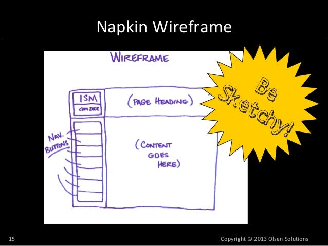
Create Wireframes of your main page and your project detail page:
A good process would be to
- create quick napkin sketches of these wireframes where you try out different layouts—where is your navigation? how dominant in size are project images? should supplementary information (credits, materials, date published, etc.) go at the bottom of the page or in the margins—these types of layout questions.
- then create a final wireframe that is a bit more polished and uniform, and save this as a PDF document that you can share with me
Create static mockups of your main page and 1 project detail page:
Generally done in Photoshop and illustrator, this is where you do your main visual design work. Here is a good process:
- Pick 1 to 2 typefaces: one that is for close reading of text, one that is for display and large text. Both embody the personality you are trying to communicate on your site. The less super extravagant flourishes the better—consult your inspiration websites to see how they use typography.
- Establish your grid:
- What is your document width: perhaps start with a document width of 1200px.
- If you have them, decide how large your side margins should be and subtract this from your total document width.
- Choose a gutter width: usually anywhere between 15–40px.
- Choose the number of columns in your grid: A number divisible by 2 or 4 is generally pretty versatile: 12 columns, 8 columns, etc. The number of gutters is 1 less than the number of columns, so use this to create and evenly space your columns/gutters. You can use actual “guides” in the Adobe software or create long, transparent rectangles.
- Put in some dummy typography that spans 3 or more columns: is the line length ok (55–75 characters long)? If not, go back to steps 3 and 4, and work on your gutter and column widths.
- Establish a color palette. It should be diverse enough to handle all your page elements: large typography, links, hovered links, background colors, colors of other graphic elements, etc. But also, it should be restrained enough that multiple colors don’t clash or overwhelm. One helpful tool is Adobe Color CC
- Design your pages: bring in your content—images and text arranged according to your wireframe. If there is motion or some dynamic elements, show a snapshot of what this may look like: what do links look like when hovered over, for example?
- Save as a PDF so you can show it off.
Class 11 — Lecture: Tables, Audio, and Video
Class 10 Lecture — Advanced CSS Motion
Class 9 Lecture — Advanced CSS
Class 6 Lecture — CSS Layouts
Class 5 Lecture — Visual Hierarchy and Grids
https://docs.google.com/a/newschool.edu/presentation/d/1YolnCIfOzqnH35jf9cut828ix9LJoYFX3xqpxL5N3A4/edit?usp=sharing
CSS Basics Properties Examples
Here is a folder with several html pages and a few css files. These illustrate the code covered in class. Please download the files and open them in Sublime to view. Comments in the files describe what is happening.