Although technology has been looked down upon over the past decade or so, sometimes it can be a useful tool. I think that expressing art pieces through a website that are located in a museum could be a great thing. Not everyone has the opportunity to go and visit all museums around the world and by show casing them through a website for everyone to see, in my opinion, is a great idea. It is hard to give people the same experience that they feel by visiting art museums, but there are definitely ways to execute that. There are some things to think about while designing the webpage. If the webpage is not designed efficiently or aesthetically pleasing it can exclude some of the experiences you would feel by physically being there. Consequently, putting museums work onto a webpage I believe can be very beneficially to people around the world, especially to inspire people everywhere.
Author / Sabrina
Reading Response 9
When it comes to designing, there are several approaches that artists can take. While I personally don’t usually work with a grid or a system, yet sometimes it may be more helpful. Designing involves a lot of thinking and planning. While designing you should think about the point you want to get across, and also be aesthetically pleasing. I do not think that you must use a grid system or choose specific fonts and colors to be a “good” design, although, using a grid may be helpful to some people. I personally think that it is harder to make a “good” design when using default settings, specifically in adobe applications. Not all of the settings look a certain way and could come across and boring or unintentional. When creating designed pieces, I feel that all elements must be thought about and chosen carefully or else it could potentially come across to someone else differently. Therefore, if you’re designing an advertising poster or website I think that you should think about all of the elements and not just throw information on the page with the defaulted system.
California Case “Reading Response”
California Case as a reading response done in html and css, uploaded to github
Reading Response 4
When thinking about design, it is important to think about the audience that you’re trying to reach.
The first step, establish the audience you’re trying to reach. Unfortunately, it is impossible to please everyone. We are all entitled to our own opinion, as long as it can be justified.
There are many talented people today that you may not be able to related to but that doesn’t mean that other cannot relate as well. Jack Hamilton said, “If you enjoy Macklemore, you have terrible taste in music.” Some may defended that statement, but for others, that cannot be true due to the large population of Macklemore fans, myself included. You cannot state whether someone is talented or not, it is strictly an opinion.
For me, I agree with the statement “Beauty lies in the eye of the beholder”, everyone is entitled to his or her own opinion.
Reading Response 5
What is the most effective way to design a lay out, whether it is with text on a page or designing a space?
When designing a space it is important to think about the people that will be engaging with the space. For example, how could you encourage a younger crowd of people to linger in a certain area, or stay away from a certain area? Think about how you would want people to walk, mingle, and exit. I agree with Erik Spiekermann when he says in the article, A Fine Balance, that things that appear symmetric can feel easy, boring, or overdone. Yet, when things are symmetric they tend to please the eye and give off a harmonious feeling. Asymmetric things can feel exciting, original, and can feel inviting, while symmetric things can feel just the opposite. In the article he says “Now take a look at the spaces that make us feel at home and make us want to spend time sitting in cafes and watching children play. They are all asymmetric.”
Web Designer Profile
Paul Trani; Interaction Design
Website: https://paultrani.com
What type of companies have they worked for? Or, what types of companies do they have as clients?
Has worked at Starz, GT Alliance, Moxie Media Group, and now is the Senior Worldwide Creative Cloud Evangelist for Adobe.
Where did they learn how to do their job? How many years of experience do they have?
Studied at Rocky Mountain College of Art and Design. Graduated with a BFA in Illustration and currently has 15 years of experience in the field.
What software or programming languages do they know?
Knows HTML, jQuery, Photoshop, ActionScript, JavaScript etc.
Who are their mentors or influencers—people they admire?
Paul Trani gets inspired by www.thefwa.com, learning from www.lynda.com and using the programs from www.adobe.com
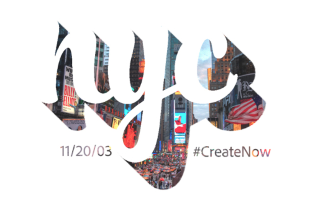
- NYC; https://www.behance.net/gallery/12311977/NYC
I appreciate this piece by Paul Trani, NYC; one reason being that his use of animation is very playful and I feel sends a strong message about NYC. His use of graphics, NYC in the shadow, and font choice, fun and script-like, are effective in sending a message about NYC.
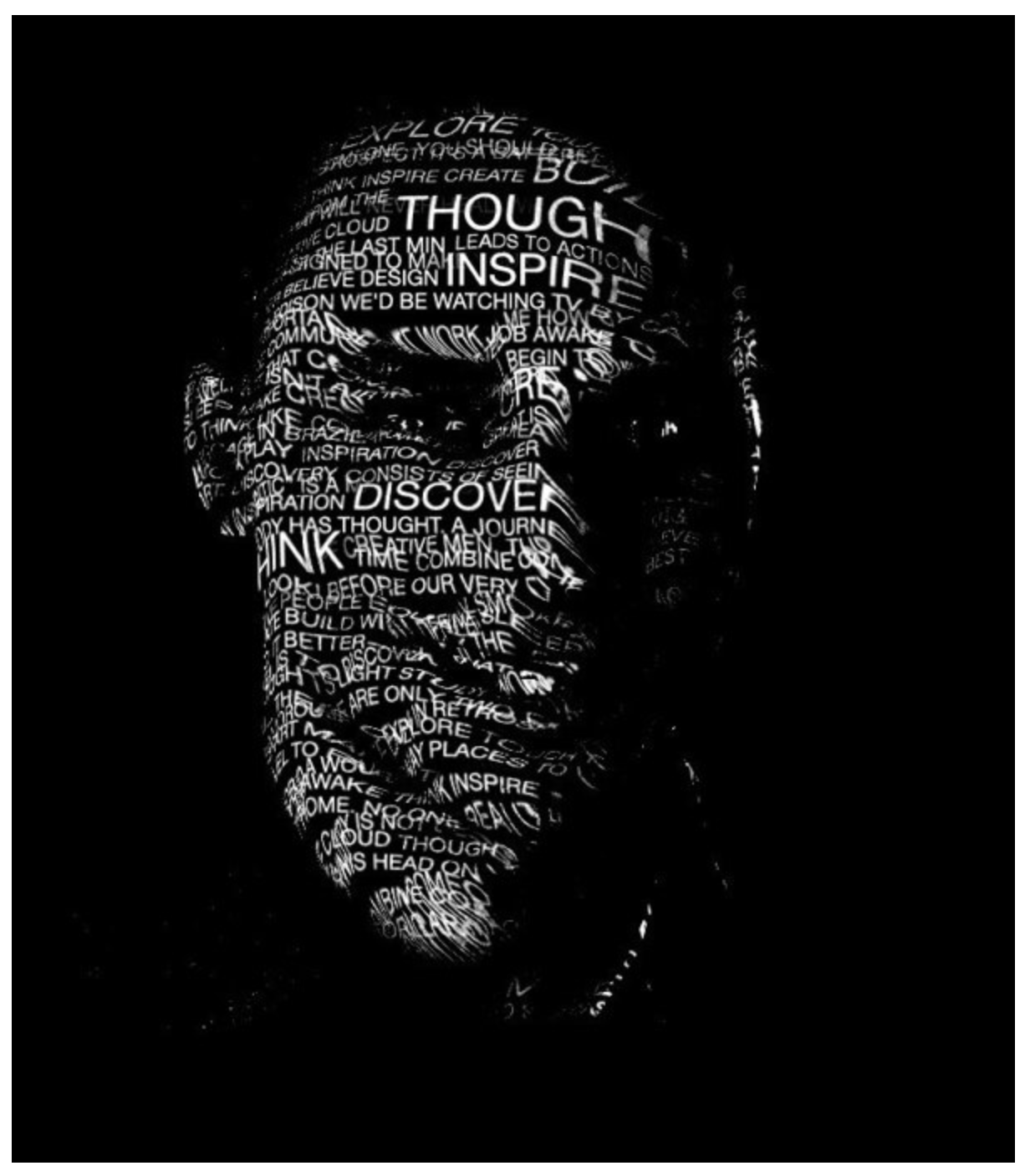
- Self Portrait; https://www.behance.net/gallery/14323007/Self-Portrait
This piece is a self-portrait that uses words “Inspire”, “Discover”, and “Think” to express him. This gives us a powerful message and a better understanding of the things/words that he found is essential and really expresses who he is. I love his use of negative space to really show off his features and also put a quarter of his face in shadow.
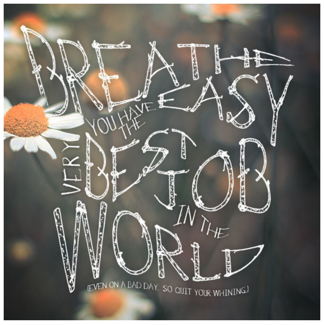
- Breathe easy; https://www.behance.net/gallery/11923195/Breathe-Easy
BREATHE EASY YOU HAVE THE VERY BEST JOB IN THE WORLD (EVEN ON A BAD DAY. SO QUIT WHINING)
This is my favorite of the three. Paul Trani’s choice of font, style, background, and orientation are beautiful. It feels childish, with the flowers and playful font, while also being humorous with the choice of text. I also find this piece to be the most relatable to my life, agreeing with him that doing what you love is not considered work.