reading | the museum interface

merging the real and virtual

thoughts on:
new conventions of display that alter the conditions for viewing art
“applications such as Instagram and Vine are also enabling new phenomenologies around the way art is encountered, experienced and considered.”
“what does it mean for us to encounter an artist’s work for the first time via Facebook or Instagram or Vine?”

maybe it has something to do with how we learn about art, through representations of art. we subconsciously assume that our works will be remembered by their documentation, rarely the actual work itself.
the museum also opens itself to new forms of public interpretation. This is a true form of institutional vulnerability.

“The museum building, you might say, is a certain platform for social interaction organized around viewing art. Transferring this concept to the Web is more complex: what if certain artworks from a museum are stolen, damaged, sold or repossessed? If these works disappear from the museum’s walls, what are the implications for that museum’s digital audiences? These works could still be displayed on its website. But something would be different.”

web design = museum curation

there is a thrill in the fact that what you see online exists in real life. the web as an alternative *option* is what makes it so exciting and widely accepted.
this can also be seen as a transition phase we are moving out of, as it is hard to maintain both ‘platforms’, probably for many reasons.
reading | captives of the cloud, part i

Here’s an excerpt from a paper I wrote about Snapchat, where I site this week’s reading.
(I took the citations out but I think it’s still pretty clear what is quoted)

Late senator Ted Stevens went down in history after referring to the Internet as a “series of tubes”. If it is rendered utterly impossible to view the entire object, it becomes theoretically, and literally, harder to grasp. Back to poor, misinformed Senator Stevens. You can almost start to see where he is coming from. For a while the technology industry depended heavily on the advancement of physical hardware – CPUs, monitors, keyboards, mice, TV screens, laptops and phones all rely on a great deal of physical sophistication to function properly. Even appliances and gadgets that are fit solely for a single purpose require this kind of consideration. So why wouldn’t the inside of these objects work in a similar way? This assumption is not entirely wrong nor is it horribly uncommon. In contrast to hardware however, software indicates that something’s value no longer depends on the measure of its physicality. Google, one of the world’s seven largest cloud storage companies, has recently compared itself to a bank. Luckily, there is enough discrepancy in this metaphor to keep it from becoming a total reality. Yet it still holds true in the sense that cloud storage companies do, like banks, rely wholly on trust. This lack of physicality can be “seen” in how much of the Internet relies on Wi-fi, which is still quantifiable in the sense that you must pay for it, but requires no physical apparatus for it to work. Post-Internet artist and theorist Artie Vierkant responds to this collapse of physical space by introducing the idea of expanding digital files to take on physical forms, or “image-objects”. Sure, all of this theory made for a fascinating press release in whatever gallery space Artie ended up showing in, but its relevance continues in how we approach designing for the future or, in other words, “moving from existing to preferred situations”.

reading | pleasurable design

As designers, where do we truly find happiness?

This article features a bunch of recent works by designers that are said to be “pleasing”, or make us happy. It seems like just as futile of an attempt at exploring happiness as any other one. This has been such a trend in design themes, but not so much in art. Stefan Sagmeister focuses on exploring happiness in The Happy Show, which is an exhibition dedicated to the understanding of what makes us enjoy certain things. It features bright yellow walls smothered with infographics based off of recent studies, and endless interactivity.
There is a new concept that Art and Design have evolved into the same. However this interest in exploring happiness distinguishes the two in a big way. When have we not seen this topic explored in science or even technology? Even better, when have we ever seen this in fine art?
The understanding that happiness means the same thing to all of us, whether we are designers, artists or scientists, is false. Trying to develop universal truths about happiness will most likely not be successful.
In this article, there are no designed objects that are out of the ordinary. A book, a chair, a vase, etc. They are all purposeful and functional in their designs, but the writer finds aesthetic pleasure in each of them. Maybe you will too! It’s a pretty well-written article after all. Why is it then, that after reading I am still left wondering more about what happiness is supposed to even be?
As designers, how can we design for happiness? Is it a matter of being happy while designing? Where and when does this magic happen? The designed objects that this writer has chosen do not necessarily please me. The bias in this article is frustrating and barely legitimate rather than inspiring, because happiness is a topic that is not based off of anything close to objectivity. You could argue that science offers some studies that contribute to the greater investigation of happiness, but as a whole it is simply too subjective to form any real truths from this type of data.
This article may be fun for someone that is not aggressively pursuing design, but for a designer, these articles – regarding aesthetic pleasure and happiness – are simply not helpful. Designers may want to subvert the concept of happiness, rather than focusing on it head-on. At least in my experiences, happiness is a thing that happens exclusively while other things are happening. In the meantime, diving into deeper more substantial areas of interest may be a quicker and less maddening path to gaining true pleasure from design.

reading | good taste doesn’t matter

Topics like objective beauty and the importance of taste make up a good portion of the worry in my head as an artist/designer. These might all be symptoms of trying to predict the future. And of course, this thought pattern is fueled heavily (if not exclusively) by ego.

I was notorious among my peers for discussing art, music, pop culture, whatever to a nauseating degree. I would voice my opinion on everything and would not sugarcoat it. Actually, the more harsh, offensive, attention-grabbing, the better. It was annoying and everyone was sick of it, but it got me plenty of attention. (See: my high school senior superlative)

my high school senior superlative

the other person who was deemed my counterpart for this title was the only dude that could tolerate/enjoy my bravely voiced opinions. I’ll give it to him, because he was equally if not more annoying.

Often upheld in history are the opinions of the academic, the intellectual, the professional, the connoisseur. Opinions that have been justified to be exceptionally significant.

Recently since our reading and writing skills have become widespread, it seems that those two things are all you need to get your opinion exposed to a community of millions. The next step: make a blog. Even better, maintain this blog for a long enough time —> ??? —> ????? —> become a fleeting ‘contributor’ to websites that publish glorified blog posts as bonafide ~*~articles~*~! Hundreds of people are now entertaining your thoughts. Your master-think-pieces.

It really is a beautifully powerful thing. This newfound accessibility and variety of opinions that have gained traction in the last decade is exciting. Rants, mock-arguments and criticisms are able to reach new depths of digesting entertainment.

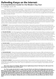
However, before it’s all fun and games, there are usually some burns to tend to; stuff that cuts and jabs. Some arguments go to excruciatingly personal lengths to target those who might disagree. (See: Defending Kanye on the Internet)

It was a cool move of the author Nishant Kothary to make contrasting references – quoting both significant , published critics with those whose opinions are far less significant to the academic community, but are equally published nonetheless.


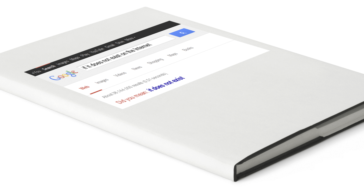
If it doesn’t exist on the Internet

thanks_wikipedia_0-500x500

Kenneth Goldsmith describes the world of academic resources to be in the midst of a stubborn transition from physical to virtual, digital. At the very end of his argument, he warns:

“Shhhh… the new radicalism is paper. Right. Publish it on a printed page and no one will ever know about it. It’s the perfect vehicle for terrorists, plagiarists, and for subversive thoughts in general. In closing, if you don’t want it to exist — and there are many reasons to want to keep things private — keep it off the web.”

My visual response is in two parts. The first and more significant one depicts the cover of a book. Usually when we look to a source of information for something in particular, we must search for it. Here I chose this search to take place within a virtual space, because web-based search engines like Google have become our first if not only attempts to look for more specific information.

The internet has become the most familiar and accessible way of researching. This mass-appeal bleeds over into the world of academia, which revolves around the abundance of well-researched documents and articles.

3_blank_books_magazines_vector

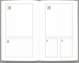
The second part of my response develops this point even further, showing the inside of the book as being completely useless. These familiar red X’s are often displayed in web applets/applications that attempt to display information, but have essentially failed.

Front-End Developer | Rachel Smith


Currently, Rachel builds all of Active Theory’s websites, which is a creative digital production company in California. Their clients include Coca-Cola, Chevy, Google, Fox and Under Armor.

Rachel holds three Bachelor degrees – The first two are from The University of Queensland, Australia in Business Management and Information Technology.

She went on to receive her most recent and relevant degree in Creative/Interactive Media from the SAE Creative Media Institute, in Sydney.

According to her LinkedIn profile, her professional experience as a developer started in 2010.

Programming languages and software Rachel knows: SVG, HTML/5, PHP, WordPress, Flash, CSS, jQuery, ActionScript, MySQL, Javascript, CMS, AJAX, Apache.

She is highly self-driven, but often looks to fellow designers for inspiration in Podcasts and articles. She is a strong advocate for communities in which women are encouraged to learn and explore code and tech. She also mentions her “love affair with the web began when her dad first brought home a dial-up modem in ’97”.

She is an avid Twitter user (11k tweets), and posts articles on her blog every week. She also frequently shares demos and tips for interactive design on a site called codepen.io.

Floaty Flutter Rainbow Stars

Hairy rainbow text

These are two of the many demos that she has shared on her CodePen profile.

Going into this research, I assumed that the lines were quite blurry between the different kinds of web designers. My background is primarily in graphic design, and Rachel is definitely not a graphic designer. From a purely aesthetic sense, Rachel is not concerned with making consistently refined-looking work. When it comes to color and typography, she really couldn’t care less. What she enjoys exploring is the functions and features – the moving parts and the purposes they serve. Based on these two rainbow themed demos, she is clearly a master at making incredibly smooth interactive work. Their functions are to appear both fun and informal for the purpose of teaching others.

Active Theory

Her most recent commercial work is a stark contrast to her demos, and rightfully so. Here she is showcasing the skills that she demonstrates informally on CodePen. In this sense she is a highly practical designer. She applies code to situations by how she sees them, whether they are commercial or semi-academic. The user’s interaction with the website is polished, but not visually interesting. It feels up-to-date, and by corporate standards, that’s all that truly matters. I appreciate the subtlety of this work.