In this insightful article, there is a deep conversation based on what web designers can do to find a balance between the real artwork versus it being placed virtually. Giampietro discusses that some viewers explain the sculpture with the smell of Walker’s installation having an impact. If someone views the artwork online none of that can be observed other than through comments on the web. However with the fast paced world that we live in today, digital databases are much more convenient than traveling an hour away from the city or on across the country to see a specific cultural art piece. Additionally, for museums to do audience research social media becomes that source instead of doing the mega slow in-person surveys. Additionally with the increase in technology, technological advances becomes an artwork and would me nothing in a 2D frozen photo. However for works that date back to the 1800s, I believe there is a disservice to the artist but possibly even more to the viewer because they don’t get to experience art by only going on online databases.
Author / Ashley
Are non-linear reading spaces or linear reading spaces more clear for the reader?
This article explains how we got to this web we have today full of unlimited use and information. As explained in the article, the intention of the web was never to have so much information available so quickly, rather have necessary information that is thoughtful with a plethora of well researched material. However, now we are left with so much information that most of the time scholars would admit to be a high percentage of the material false. If information was harder to get then the non-linear reading space would give someone all well researched truths instead of clicking through millions of contradicting articles. I do think that the linear reading spaces gives the reader an opinion to interpret for themselves what is bad and good information. Although, the non-linear reading space gives a reader all the information needed about a certain topic in the paper, for example a definition of a word and the article come together not separately of dictionary.com and wikipedia. It is a complicated topic but both have pros and cons that can be discussed over and over, unfortunately as we live in 2015 we must sort out the bads and goods of the linear reading space.
How can a designer clarify the point of a website to create a more successful website vs one of “good taste”?
While reading this article, I agree that everything that is an art form is subjective. I believe however there is a rate of successfulness dependent on what the designer wanted to accomplish in the end. Being worried about creating with good taste gets in the way of being completely creatively free and can hinder the successfulness or the end product. The thought to not “start out with a solution set (because) that has already excluded a majority of the possibilities” which makes me wonder if designers at large corporations aren’t given the final end note then how could they find a satisfying end with nothing met or really assigned. However, maybe a solution is not directly related to what is needed at the end, ie a portfolio website. I believe to clearly create a succesful website that is not necessarily related to good taste is to have an end goal and a general path (clear wireframes, static mockups etc.) to follow so the process doesn’t keep going round circle and not have anywhere to end.
Is minimalistic art on the same grounds as Default Systems?
The idea of default systems defined by Rob as the “preordained settings found in common design programs… that a user (or designer) manually override” seems to be aligned with art schools intrigue of minimalism. To keep everything simple (KISS) has been a big thing in design and what the MOMA is clearly based upon. Modernity comes with simplicity is what is circling in current design. Conceptual art which Rob speaks to it being opposing from default systems seems to be somewhat accurate, however there are exception like the examples he’s posted where default systems are used as humor. This I feel to be similar to minimalism because artists who have this ability to create the art could be creating that humor. Default systems is very straight forward and so is minimalism, a stripe across a page can have no other explanation that that is is perfectly in the center of the canvas and the lines are straight; also similar to default systems where a font is a font no reasoning just so the page is clean and simple.
Can design ever have too much functionality?
In this reading the writer mentions four ways in which design can benefit us; pleasing, entertaining, surprising, and astonishing us. In the 21st century, products have become more and more functional but the idea of having to label something to be “user friendly” makes me question if something wasn’t what is the point of that product to be put out to have users. Products in the past have only had one function, for example a cell phone just made phone calls not to surf the internet, play games, track spending habits etc. Sometimes in the world of technological development the need to have pleasure, entertainment, surprise, and astonishment in one product is a lot and almost makes something not functional and not necessarily pleasing. I do agree that some products are complicated now because of the industry and pushing to create something new, like the 3D printer, a product meant to be run by a specialist. In my experience with 3D printing it is definitely satisfying after the hours and hours of work and holds both astonishment and surprise. In conclusion, reading this article and thinking about the products that I own, it is convenient to have all these elements in one but to other generations they would not necessarily call anything “user friendly” now.
Pamela Pavliscak
Pamela Pavliscak
Part ethnographer, part data scientist, and part behavioral psychologist
What type of companies have they worked for? Or, what types of companies do they have as clients?
Adecco, Ally, Audible, Citi, Corcoran, Digitas, eMusic, IEEE, KLM, NBC Universal, The New York Public Library, PNC, Prudential, Publicis, Quest Diagnostics, Sanofi-Aventis, Sealy, Sprout, SunTrust, VEVO, Wiley
Where did they learn how to do their job? How many years of experience do they have?
Pamela has a MS in information science from University of Michigan and 15 years of experience.
What are the skills they use every day?
Through her startup Change Sciences they help companies create a better understanding of who their consumer is through user experience labs, mobile testing, remote usability testing, in-context interviews, focus groups, competitive benchmarking, ethnographic studies, diary studies, online surveys, card sorts, social media sentiment analysis and cross-channel research.
What software or programming languages do they know?
Who are their mentors or influencers—people they admire?
Finally, find 3 projects in their portfolio that you enjoy and describe why you enjoy each one in 3–4 sentences. Save links to a few images of each project or (if the projects are existing websites) links to live websites.
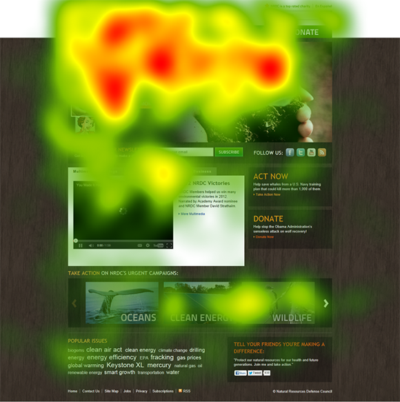
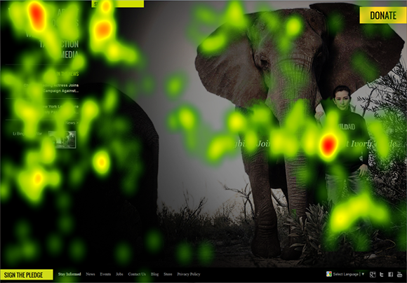
1)Collected data on what the user initially sees on a charity page. For a charity their main mission is for the viewer to see the mission statement and the ways to donate. Change Sciences uses eye heat maps to identify the main focus point.
2) She collects data on happiness and how technology makes someone feel smarter, more connected, and happier. The data then lead to 5 conclusions about how happiness connected with the success of websites. Ultimately positive emotions result in positive actions.
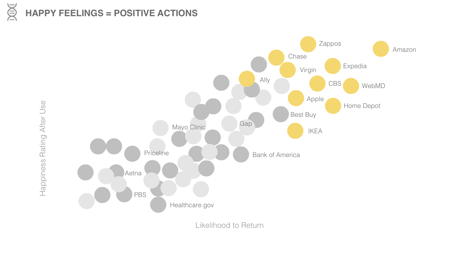
https://www.changesciences.com/the-impact-of-happiness-on-online-experience
3) Pamela researches and looks through data to see the new relationship between phones, people, and interaction between each other. She gathers data on where we use our phone more often and when with the focus not only in the US but globally too. With all this information, she concludes with how it can create conclusions in order to create a better user experience.