Insides the Lines + A Fine Balance

For this week’s reading and podcast I decided to create a webpage. I started with very calm colors green and yellow because the article and podcast had a very calming sense. rather than an argument or debate, they seemed like they were more of discussions. I then added the title Insides the Lines + A Fine Balance in a white courier font because I thought that really made it stand out from the rest of the text.

I then have two separate div’s. Both with green backgrounds. One has an image and is floating to the left and the other is floating to the right. The one on the right has a summary of the article and podcast while the one on the left has an image.

file:///Users/AllisonPinz/Documents/PSDM/year_1/semester_1/Basic%20Web%20Design/Journal2.html

Reading response 5

Question: Is it possible to completely write off symmetry in all aspects of design?


In the article A Fine Balance, the writer Erik Spiekermann seems to have a oppositional view towards the idea of symmetry in design, instead favoring asymmetry. His reasoning for this is that symmetry is too easy and boring. He claims that asymmetry is more accessible and dynamic. He states that within the setup of a page, having elements find their natural position makes it more approachable and easy to read. I agree–partially.

I think that when Spiekermann talks about symmetry, he’s talking about the very generic idea, where two sides of something look exactly the same. However, I think that symmetry is necessary and always somewhat evident in a work, maybe not in a completely obvious and unnaturally even sense, but in other ways. Even if two parts of something don’t look  exactly the same, there still needs to be an aspect of balance, so that the viewer does not becomes overwhelmed. In my opinion, asymmetry is not possible without a level of symmetry involved.

Reading Response 5

What is the most effective way to design a lay out, whether it is with text on a page or designing a space?

When designing a space it is important to think about the people that will be engaging with the space. For example, how could you encourage a younger crowd of people to linger in a certain area, or stay away from a certain area? Think about how you would want people to walk, mingle, and exit. I agree with Erik Spiekermann when he says in the article, A Fine Balance, that things that appear symmetric can feel easy, boring, or overdone. Yet, when things are symmetric they tend to please the eye and give off a harmonious feeling. Asymmetric things can feel exciting, original, and can feel inviting, while symmetric things can feel just the opposite. In the article he says “Now take a look at the spaces that make us feel at home and make us want to spend time sitting in cafes and watching children play. They are all asymmetric.”

Reading Response (Class 5)

Is web design really similar to designing a book? What are some issues with the idea of robots designing web pages?


The podcast compared the web design layout to the ways books are designed. On a superficial level this metaphor is useful but I think that the way web design can be viewed should be deeper than this.  The fact that our society is so interconnected with the way digitally is viewed and used should push us to stretch our minds in order to think of new ways to see digital spaces instead of neutralizing it.  The act of standardizing what websites look like implies there is a departure of web design from art as it becomes more about fitting the norm. This is also concerning when thinking of computers as opposed to humans creating websites which would ultimately yield to the end of intentional and thoughtful human interaction with digitally.  The design of digital spaces and websites does influence the content we view and I think as creators it is important to stay involved.

Reading Response – Class 5

How important is symmetry when we talk about design?

On the reading “ A Fine Balance”, the author talks about how boring is symmetry, praising, on the other hand, the asymmetrical. However, in some way, there cannot be asymmetry without symmetry. To understand asymmetry one has to first understand what is symmetry. And, on the contrary to what the author states, making something symmetrical is not always an easy task. On the same note, making something asymmetrical is also hard. Nevertheless, there shouldn’t be a competition about which one of these is harder. Both designs have their own difficulties. It is challenging to create something symmetrical without being boring and square. At the same time, it takes some skill to make something asymmetrical, but not messy and overwhelming. Maybe the author was right when saying, “Pure symmetry will hardly ever do”, because perhaps, a good design has to have a balance between symmetrical and asymmetrical, and so, pure asymmetry will also hardly ever do.

Regarding a fragment of the talk “Inside the Lines”, it is interesting to notice what one of the people say about websites starting to look alike, nowadays. The person states that maybe it is a good thing that this is happening, just like books that are laid out all the same, because people get more concerned about the content itself. It can’t be known if this is an absolute truth, but perhaps designers are trying to find a way to make the design look seamless, that is, flowing well with the content, which makes sense, because a good design is indeed a seamless one.

Response: Good Taste Doesn’t Matter

For my response to the article Good Taste Doesn’t Matter I chose to create a webpage. The webpage contains a summary and a drawn picture of a man riding an elephant. I chose to use this media because I thought it would be interesting to use my web design skills.

The orange color of the background is a warmer color and stands out against the black text. I chose the fonts of the headings from Google Fonts and the rest of the article is in Helvetica so it is simple and easy to read.I felt it added to the modern theme of the article. The drawing represents the metaphor the author describes in the article and I felt it was a key component to the reading.

file:///Users/AllisonPinz/Documents/Good%20Taste%20Doesn’t%20Matter.html

Reading Response (Class 4)

Is “killing your idols” the end all be all in regards to the myth of objectivity?

In his piece, Kothary points the reader to Haidt’s research that posed reason as  an unstable concept with no possibility of being truth. Our natural inclination to find the truth often goes hand in hand with our desire to find reason and if reason is not a consistent truth than much of what we believe to be objective is created in the mind. His metaphor of the rider / elephant  can be seen in institutions like media and education where we are showed only what has been deemed as objective but as Kothary explains the insidious desire for objective truth affects taste as well.
In order to kill idols I think there is also a greater need to kill objectivity and our desire to see objectively. Killing what we have noticed before as being beautiful is important but I think there is also great value in continuously deconstructing what we see as “knowledge”, where it comes from  and who created it. If we see something as beautiful, it is definitely helpful to realize there is beauty and importance beyond that, but more important is the realization that the institution of beauty has been created in our society to maintain certain patterns of thinking.

reading | good taste doesn’t matter

Topics like objective beauty and the importance of taste make up a good portion of the worry in my head as an artist/designer. These might all be symptoms of trying to predict the future. And of course, this thought pattern is fueled heavily (if not exclusively) by ego.

I was notorious among my peers for discussing art, music, pop culture, whatever to a nauseating degree. I would voice my opinion on everything and would not sugarcoat it. Actually, the more harsh, offensive, attention-grabbing, the better. It was annoying and everyone was sick of it, but it got me plenty of attention. (See: my high school senior superlative)

my high school senior superlative

the other person who was deemed my counterpart for this title was the only dude that could tolerate/enjoy my bravely voiced opinions. I’ll give it to him, because he was equally if not more annoying.

Often upheld in history are the opinions of the academic, the intellectual, the professional, the connoisseur. Opinions that have been justified to be exceptionally significant.

Recently since our reading and writing skills have become widespread, it seems that those two things are all you need to get your opinion exposed to a community of millions. The next step: make a blog. Even better, maintain this blog for a long enough time —> ??? —> ????? —> become a fleeting ‘contributor’ to websites that publish glorified blog posts as bonafide ~*~articles~*~! Hundreds of people are now entertaining your thoughts. Your master-think-pieces.

It really is a beautifully powerful thing. This newfound accessibility and variety of opinions that have gained traction in the last decade is exciting. Rants, mock-arguments and criticisms are able to reach new depths of digesting entertainment.

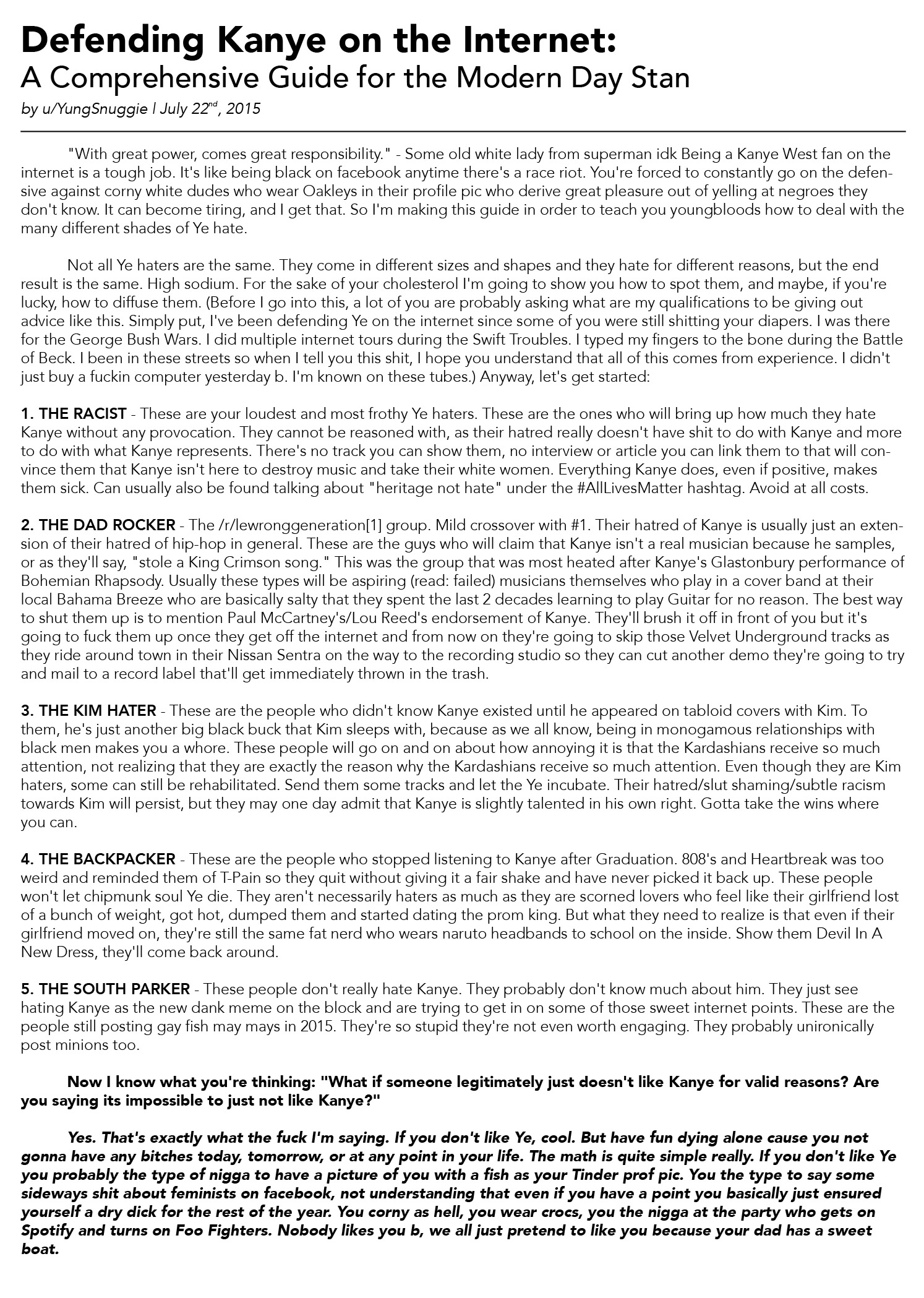
However, before it’s all fun and games, there are usually some burns to tend to; stuff that cuts and jabs. Some arguments go to excruciatingly personal lengths to target those who might disagree. (See: Defending Kanye on the Internet)

It was a cool move of the author Nishant Kothary to make contrasting references – quoting both significant , published critics with those whose opinions are far less significant to the academic community, but are equally published nonetheless.