Web Designer Profile- Yesenia Perez-Cruz

10556250_10100983111837896_5069286320846929326_n

Yesenia Perez-Cruz

User Experience Designer (UX)

a) Yesenia Perez-Cruz is currently a Senior Product Designer at Vox Media. Previously she was a Senior Designer at Happy Cog and a User Experience designer at Intuitive Company. Through her young career she has designed for clients like Zappos, MTV, and Chef Jose Garces.

b) Yesenia Perez-Cruz spent four years at Drexel where she studied graphic design.

c) As a designer Yesenia is involved in strategy, information architecture, wireframes, and aesthetic design, as well as communicating with developers about how to make that come to life.

d) In an interview with Tina Essmaker, Yesenia said her time at Happy Cog has influenced her greatly and was a place for great experimentation along great mentors. “I was encouraged to push myself and find new ways to solve problems, which is how I grew so quickly.” It was her first job after college.

MTV O MUSIC AWARDS 3

OMA10
Yesenia Perez-Cruz has been designing  “the look”  for The O Music Awards for the past three years. The O Music Awards are an annual online music festival and awards show. The design work done by Yesenia in this project is really good because  she creates well organized graphics and her compositions are very strong. Much of her work in this project serves as purpose, as they are created to interact with the user/audience and deliver information.

EL NUEVO DÍA

1431273099015-1
El Nuevo Día is the most trusted and read newspaper in Puerto Rico. Yesenia redesigned and brought to life their website and mobile site. I really like her work in this project because she takes into consideration the importance of the newspaper and their establishment in the community so her design is more straight forward, elegant and accessible.

GARCES Project

Garces01

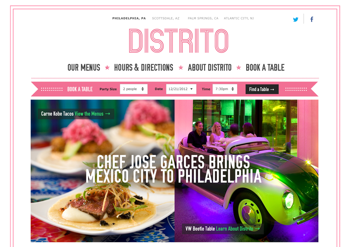
Yesenia also designed the website and design system for Iron Chef Jose Garces. Her work for this website is great because it brings focus to the two most important things about the restaurant , the food and the venue. Her website is also very easy to use and well organized by importance to both the costumer and the owner. Her color palette also goes well together by having pictures and layout colors that go well together.

If It Doesn’t Exist on the Internet, It Doesn’t Exist – Maria Jessica

We sometimes would get frustrated if Google is not showing what we are looking for. In fact, not all materials available for free and unfettered access to all. Then we have to pay certain of many to become a member and get an access to the website or buy the hard copy book. As a result many of the writers might not surprise that their work doesn’t not exist because they don’t exist on the Internet. For example, Goldsmith experience when he was invited on a reading tour of Scandinavia where no one knows his eight books he had published over the past decade. Everyone recognizes him from his work on the Internet. Definitely, Internet helps writers to extend their careers and book publishing. But it forgets the value of the book, authorities, credibility, and publishing houses. As Goldsmith also mention that the publishing houses and magazines don’t make writes rich, they only extend writers’ career a frame for the work to exist as same as Internet.

In my opinion, Goldsmith thinks that the writes cannot earn more money by depending only to the book publishing. While, putting all of the works on the Internet can caused loss of the writer’s hard work such as no-credibility, no-value, and plagiarism. Not only that, book publishing such, as Barnes and Noble also might not completely put the value of the book. They let the consumers to use books for research purposes without having to buy them. Such as sit on soft chair, sipping up a cup of coffee and taking notes on a laptop. But it is educators and intellectuals’ obligation to make knowledge (book) can be accessed by all.

In the long run, I think only students, educators, and fraction of web users who can have free access. Whenever they must put credits or how spotify work by pay small of money. For example the school department funds all the expenses for online access or printed book in their own library. Besides that writes’ name can be know by mouth-by-mouth, credits, promoting their works on the internet by giving sample of book’s pages or review from the readers. Then again, it is the problem of access, the speed of academic blogging, and socialization.

Screen Shot 2015-09-09 at 1.21.25 PM

Web Designer Profile | Dimitri Didorenko

a) Dimitri Didorenko has developed web applications as a Senior Front-End Developer since 2009, and for the past 5 months has worked at Outbox.

2 b) Didorenko first attended Optical-Mechanical Technical College in Ukraine in 1988 and has received additional degrees in sound engineering and biblical studies.

2 c) Didorenko’s two greatest skills are Web Development and Date Management, but he states that the opportunity to work in many different environments has led him to develop a greater array of web projects for different companies.

2 d) Didorenko’s primary languages are JavaScript / AJAX, PHP, and HTML5.


3 a) http://www.outboxtechnology.com/

Outbox  facilitates ticket sales for large venues and stadiums. What interests me the most about the site is how easily it is navigated. Although I have little interest in the actual service Outbox offers, I appreciate the design of its web page.

3 b) https://www.desjardins.com/ca/index.jsp

Desjardins is a cooperative financial group in Canada and similar to my interest in Outbox’s site, I’m more attentive to UI than what is being advertised. It’s hard to find something that I like about Desjardins’ site. The “about us” tab has an interesting collapsing animation.

3 c) http://www.2020spaces.com/

I’m not clear what service 2020spaces is offering, but I think how the web page uses transitional animations is effective. It’s unusual that such an involved UX doesn’t quickly become frustrating for the viewer. I think it’s because the animations are quick and precise, guiding the user through the web page rather than distracting them.


Pamela Pavliscak

Pamela Pavliscak
Part ethnographer, part data scientist, and part behavioral psychologist

What type of companies have they worked for? Or, what types of companies do they have as clients?

Adecco, Ally, Audible, Citi, Corcoran, Digitas, eMusic, IEEE, KLM, NBC Universal, The New York Public Library, PNC, Prudential, Publicis, Quest Diagnostics, Sanofi-Aventis, Sealy, Sprout, SunTrust, VEVO, Wiley

Where did they learn how to do their job? How many years of experience do they have?

Pamela has a MS in information science from University of Michigan and 15 years of experience.

What are the skills they use every day?

Through her startup Change Sciences they help companies create a better understanding of who their consumer is through user experience labs, mobile testing, remote usability testing, in-context interviews, focus groups, competitive benchmarking, ethnographic studies, diary studies, online surveys, card sorts, social media sentiment analysis and cross-channel research.

What software or programming languages do they know?

Who are their mentors or influencers—people they admire?

Finally, find 3 projects in their portfolio that you enjoy and describe why you enjoy each one in 3–4 sentences. Save links to a few images of each project or (if the projects are existing websites) links to live websites.
1)Collected data on what the user initially sees on a charity page. For a charity their main mission is for the viewer to see the mission statement and the ways to donate. Change Sciences uses eye heat maps to identify the main focus point.

3a6ce586-a6eb-4d9f-b0bb-199533ad5683 314b9115-c010-4748-a23f-a279212431ca

2) She collects data on happiness and how technology makes someone feel smarter, more connected, and happier. The data then lead to 5 conclusions about how happiness connected with the success of websites. Ultimately positive emotions result in positive actions.

txfq7rf2xlfngfqfsmsg

https://www.changesciences.com/the-impact-of-happiness-on-online-experience

3) Pamela researches and looks through data to see the new relationship between phones, people, and interaction between each other. She gathers data on where we use our phone more often and when with the focus not only in the US but globally too. With all this information, she concludes with how it can create conclusions in order to create a better user experience.

Web Designer Profile – Maria Jessica

JOE STEWART (interaction design)

He works as a partner at Work&Co, a digital product design company based in New York and Portland.

  • He worked design and branding such as Virgin America, Target, Chase, Aden + Anais, Goodgle, Trip Advisor, Eurosport, Oi, TMZ, The Met Opera, NBA and Youtube. He also was a partner with Global Creative Director at Huge. He works with a companies to participate directly with his team in collaborative process such as measures of success, rapid prototyping, and continuous testing, improvement. For example Target, they create a strategy, design, branding, guest friendly digital experience launching in 2016
  • He has 18 years of digital experience and hands on designer. He was named as one of the “top 50 Web Designer” in the world by Net Magazine. He is also a public speaker within a design community, writer, and juror for Cannes, SXSW, the webby awards, the pixel awards, and Fast Co. He likes to think that everyone is responsible for the product as a whole. IF something is wrong, there is nobody to blame

“I love user testing prototypes, and when you know real people going to be touching your designs at the end of the week it changes the way you think about that you’re making in a very real way” – Joe Stewart

He learned that prototyping or the process of creating an interactive working model of a design proves a design team the ability to look how the design will work structurally and interactively.

  • “The earlier you start prototyping, the earlier you get to see how fucked up your design are and start fixing them” – Joe stewart

Because in relationship between the designer and developers can improve when they see the result to see the flaws and develop it.  For example first we just simply expresses our idea, second tyring to understand the overall design, third is making the user test.

  • Joe stewart usually use software for work such as quartz composer, UX, Marvel, Proto, invision, after affect, ad keynote.
  • His two biggest inspiration are the design of BRAUN and PETER SAVILLE. He is completely obsessed by the pencils of Faber-Castell and Swiss Army Knives

Screen Shot 2015-09-09 at 1.00.14 AM


In my opinion this Moma Store’ web design is easy for the viewer to see the detail the the product. It doesn’t have much color but it emphasize the product and the Moma Store has it owns black color font so it would not confuse the viewer. It is simple and contains what the viewer needs when they want to buy the product without going to the stores.

Screen Shot 2015-09-09 at 1.00.29 AM

The first page of the jetblue design shows what people need when they go to the airline’s website, how to purchase the tickets and ticket promo. Some website might show the introduction, clip and the airline identity. But what actually people need is straight to the point how to purchase the ticket and the ticket promo is part of the business oriented.

Company Website

Screen Shot 2015-09-09 at 1.47.16 AM

Screen Shot 2015-09-09 at 1.47.29 AMScreen Shot 2015-09-09 at 1.47.37 AM


What I like about this company design is simple and emphasize the information. Such as the background of the company information by playing with the size and color of the font. And their vision and mission is short but can bee seen by the clients they have been working with.


Front-End Developer | Rachel Smith


Currently, Rachel builds all of Active Theory’s websites, which is a creative digital production company in California. Their clients include Coca-Cola, Chevy, Google, Fox and Under Armor.

Rachel holds three Bachelor degrees – The first two are from The University of Queensland, Australia in Business Management and Information Technology.

She went on to receive her most recent and relevant degree in Creative/Interactive Media from the SAE Creative Media Institute, in Sydney.

According to her LinkedIn profile, her professional experience as a developer started in 2010.

Programming languages and software Rachel knows: SVG, HTML/5, PHP, WordPress, Flash, CSS, jQuery, ActionScript, MySQL, Javascript, CMS, AJAX, Apache.

She is highly self-driven, but often looks to fellow designers for inspiration in Podcasts and articles. She is a strong advocate for communities in which women are encouraged to learn and explore code and tech. She also mentions her “love affair with the web began when her dad first brought home a dial-up modem in ’97”.

She is an avid Twitter user (11k tweets), and posts articles on her blog every week. She also frequently shares demos and tips for interactive design on a site called codepen.io.

Floaty Flutter Rainbow Stars

Hairy rainbow text

These are two of the many demos that she has shared on her CodePen profile.

Going into this research, I assumed that the lines were quite blurry between the different kinds of web designers. My background is primarily in graphic design, and Rachel is definitely not a graphic designer. From a purely aesthetic sense, Rachel is not concerned with making consistently refined-looking work. When it comes to color and typography, she really couldn’t care less. What she enjoys exploring is the functions and features – the moving parts and the purposes they serve. Based on these two rainbow themed demos, she is clearly a master at making incredibly smooth interactive work. Their functions are to appear both fun and informal for the purpose of teaching others.

Active Theory

Her most recent commercial work is a stark contrast to her demos, and rightfully so. Here she is showcasing the skills that she demonstrates informally on CodePen. In this sense she is a highly practical designer. She applies code to situations by how she sees them, whether they are commercial or semi-academic. The user’s interaction with the website is polished, but not visually interesting. It feels up-to-date, and by corporate standards, that’s all that truly matters. I appreciate the subtlety of this work.

Codecademy Screenshot Process

When you complete a track on Codecademy, here is the screenshot process:

  • Take a screenshot of the course track page, which should have a “finished” button, and your account avatar should be visible in the top right corner:
    Screen Shot 2015-09-08 at 11.03.47 PM
  • Follow this naming convention to be counted for a grade: FirstName LastName + Default file name + png. In essence, you type your name right at the beginning of the filename leaving the default file information for the screenshot intact:
    screenshotnaming
  • At the conclusion of the course, go to your Profile, and take a screen shot showing all of the completed courses you’ve done:Screen Shot 2015-09-08 at 11.03.30 PM

Most likely, you will have partially completed tracks (such as the JavaScript track). That is ok, but there will be a specific % that will be considered complete for that course, meaning that instead of the track progress saying “Finished”, it will say a %. I’ll update you with that exact % amount for the relevant courses towards the end of the semester.

Web Designer Profile

Joe Stewart –interaction designer

    1. What type of companies have they worked for? Or, what types of companies do they have as clients?                                                                               He currently own a digital product design company, Work&Co. He used to work as an interaction designer. He worked at Huge for 7 years before he co-founded Work&Co. His client includes Target, MoMA store, Reuters , jetBlueVirgin America, Youtube,etc. Now his client include NBA, Google, Youtube, Virgin America,etc.
    2. Where did they learn how to do their job? How many years of experience do they have?                                                                                                                           As he described in the interview, as an interaction designer, you have to learn every 2 years. He worked at Huge for 7 years, then he co-founded Work&Co at 2013, which means he worked at Work&Co for 2 years now. He has 18 years of digital experiences.
    3. What are the skills they use every day?                                                                    He uses Quartz Composer and Form to see the design and the scale in prototype, he so user testing while he is not sure which prototype is better. Prototype is the skill he used everyday, instead of making presentation to his client.
    4. What software or programming languages do they know?                              He uses program like, Marvel,Proto.io,Invision. He also used AfterEffect or Keynote when he wants to look for something quick and cheap.
    5. Who are their mentors or influencers—people they admire?                          He is influence by the design works of BRAUN, design work of Peter Saville. He loves to take photo and post them on his VSCO page. He is also influence under the Todd Purgason at JUXT Interactive.

 3 projects

Screen Shot 2015-09-08 at 9.58.16 PM


MoMA Store

I think the design for the MoMA store is clever, I like how everything is very straight forward. It is good to look at. The object are the center of the page, unlike many other commercial good website. The image of the product has to zoom in to see the detail. This design highlight the detail, also brings customers a artistic experience while using the website
Screen Shot 2015-09-08 at 10.49.29 PM

Virgin America

I enjoy the website because it is easy to use with big font and reminder bar on the top, also the color usage is coherent with the brand image. The interaction design guide you through each steps, from selecting date to Flight. Very friendly to use.

Screen Shot 2015-09-08 at 11.03.31 PM

Showtime-Xbox 1

I like the white text against the black background, it gives people a professional look. The minimal text also help with the user experience. Again the new platform is easy to use and right to the point.  As it is described, new platform results included increases in usage, content discovery, and subscriber loyalty.


Web Designer Profile

  1. Milton Glaser


2a. Glaser is best known for creating the iconic I <3 NY logo. He’s created designs for New York Magazine, The School of Visual Arts, Esquire Magazine, Brooklyn Brewery, Julliard, Sony, The Metropolitan Opera, and much more.


2b. Once he graduated from Cooper Union, he founded Push Pin Studios in 1954. He’s been involved with Graphic Design for over 60 years.


2c. Glaser remains engaged with the world and constantly thinks about changes happening in style and themes over the years, in order to keep designs up to date.


2d. Glaser doesn’t like using computers for design; he’d much rather hand draw. His skills are minimal with the computer.


2e. Glaser draws inspiration from a wide array of artists ranging from Picasso and Morandi to Herbert Bayer and George Salter.


3a. Glaser is most famous for his I <3 NY logo. With this simple design, Glaser created an icon for New York City. Tourists and people visiting feed into the stereotype that is Times Square and eventually created a commercial empire around it.


https://upload.wikimedia.org/wikipedia/commons/thumb/d/d5/I_Love_New_York.svg/2000px-I_Love_New_York.svg.png


3b. Glaser’s famous Bob Dylan poster is one of my personal favorites. The design and color accurately capture the 70’s era- simple and colorful. Bob Dylan’s music and the simple design of the poster mesh together nicely. The smooth look and block letters on the bottom emulate Dylan’s style.


http://www.miltonglaser.com/files/milton-16340-31.jpg


3c. The Saratoga Festival poster embodies the overall theme of Glaser’s work, which is majority flat and simple, but always with a pop of color. The bright circles create a very flat dimension to the poster but at the same time move my eye across the page. Also, the lack of information and detail on the poster maintains the simple layout.


http://gallery515.com/wp-content/uploads/2012/08/Milton_Glaser_Saratoga_Festival.jpg